Web sites for Okapi and StuffandNonsense
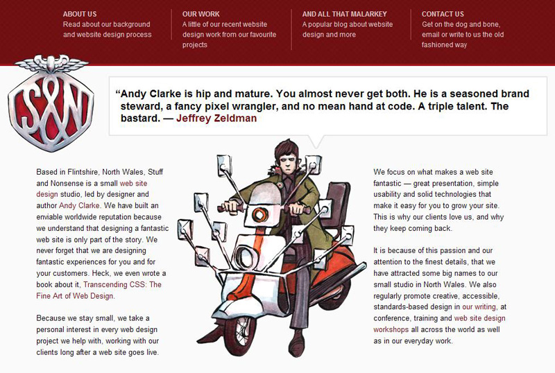
The first web site I selected is from Stuff And Nonsense Web site Design Studio. I selected it because it talked about and reflected a lot of things we have been studying in class about making web sites attractive and readable across multiple browsers.
There are also specific details about the site that I like:
- On the Work page, I like that although the projects are stacked on top of each other, pieces of the images overlap with other projects. I feel that this keeps the layout from being too sterile.
- Their Blog has a lightly different layout from other blogs. The column widths are mixed up a little, so that the widest column is not in the middle.
- They have injected some additional humor into the site by making the Help section multi-level. It's funny, but at the same time serious, because there ARE people who have very very little knowledge of the internet.
- I was a little confused by which images were supposed to enlarge upon clicking and which were supposed to take me to another page. There did not seem to be a pattern.
- The text wrap on some of their Work pages was a little awkward or text color blended into the background image and made it difficult to read,

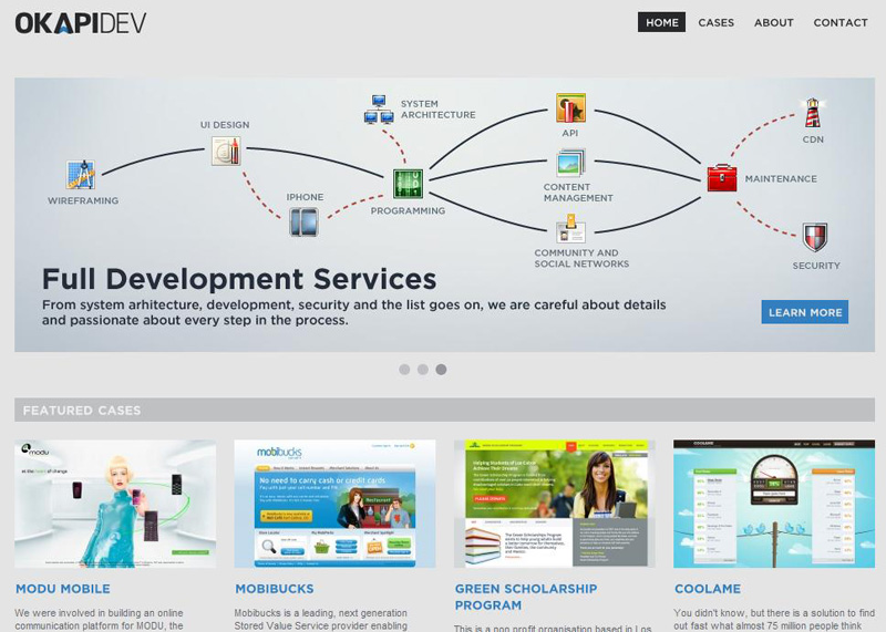
The next web site that I selected was for Okapi Creative Agency. Although the website was more subdued and not as interesting in its choice of colors and images, I thought it was a very good example of organizing information in a clean, easy to understand way. I was confused by the fact that their return buttons looked like broken links, and their list of clients was not clickable, but overall I think it is an elegant, attractive site.
