Show and Tell
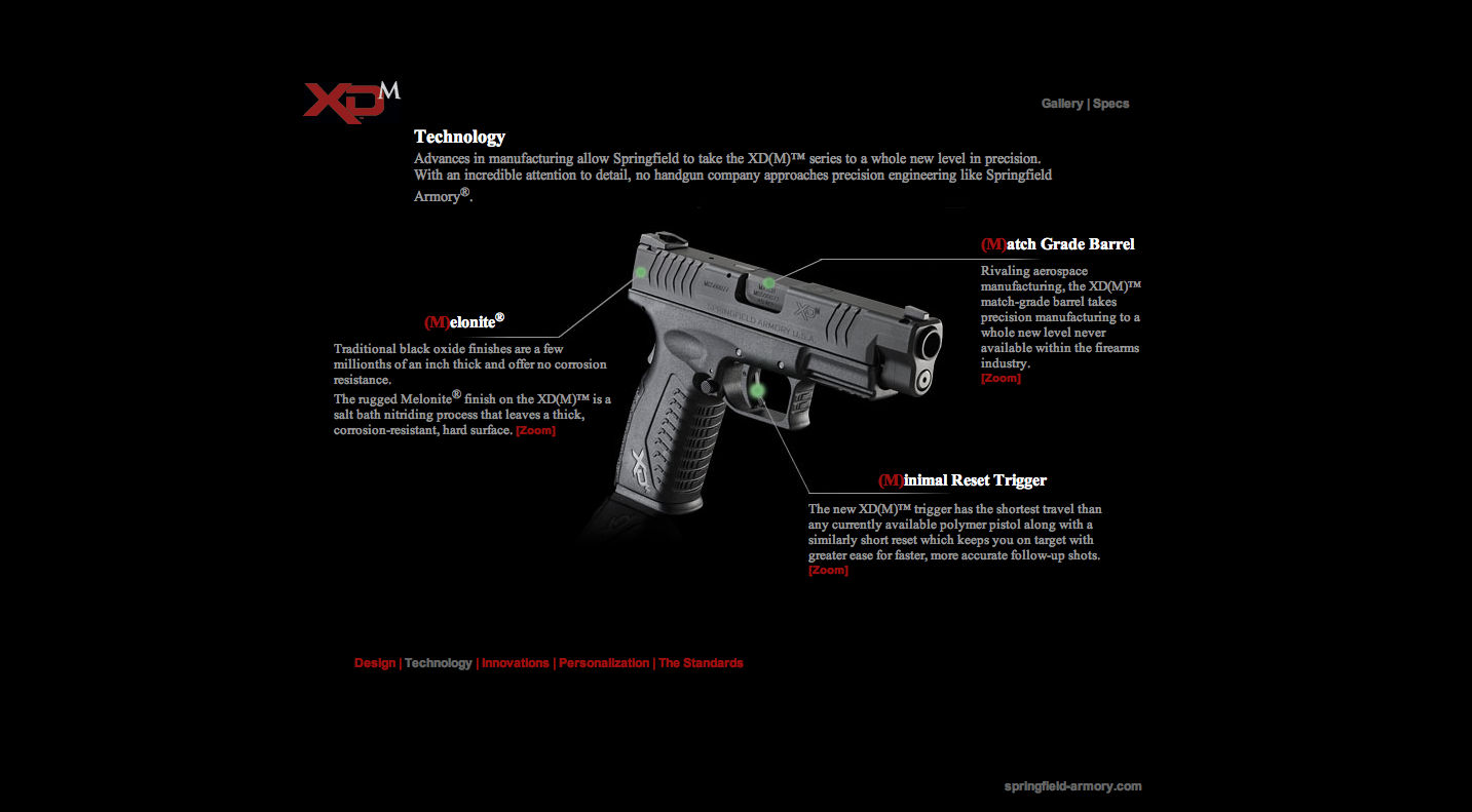
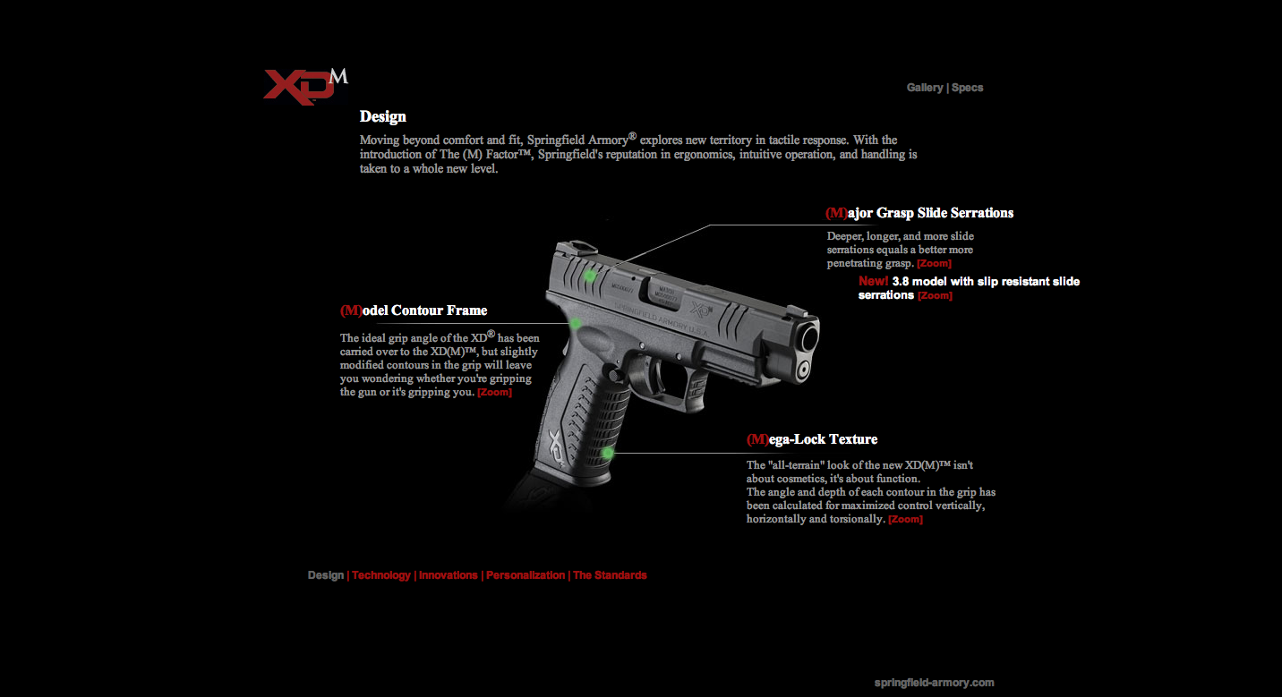
This first website is The-M-Factor. It is great for this project because it used a method where the diagram of the guns have a background image with the lines on it and then the text is positioned around the photo. It was a great technique and something that I think I can achieve.
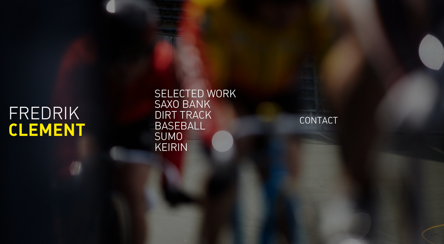

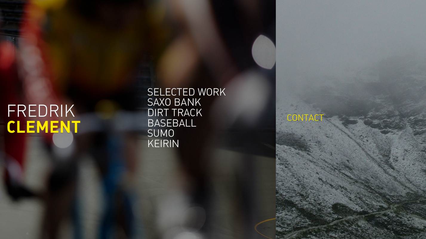
This second website Fredrik Clement. I thought this was a very interesting website because it not only scrolls up and down but side to side. This is the portfolio of a photographer and you can tell that the main focus is his images. I think it works really well for his purpose.
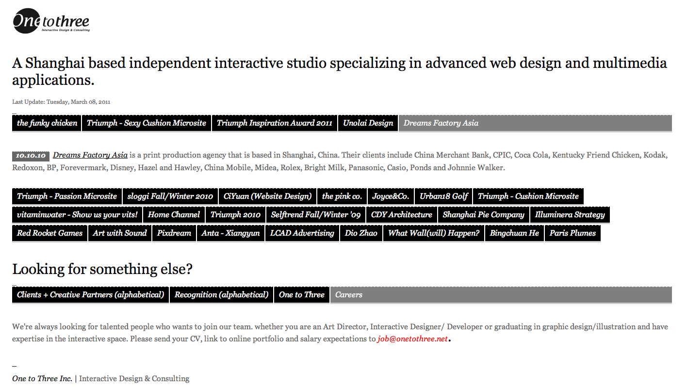
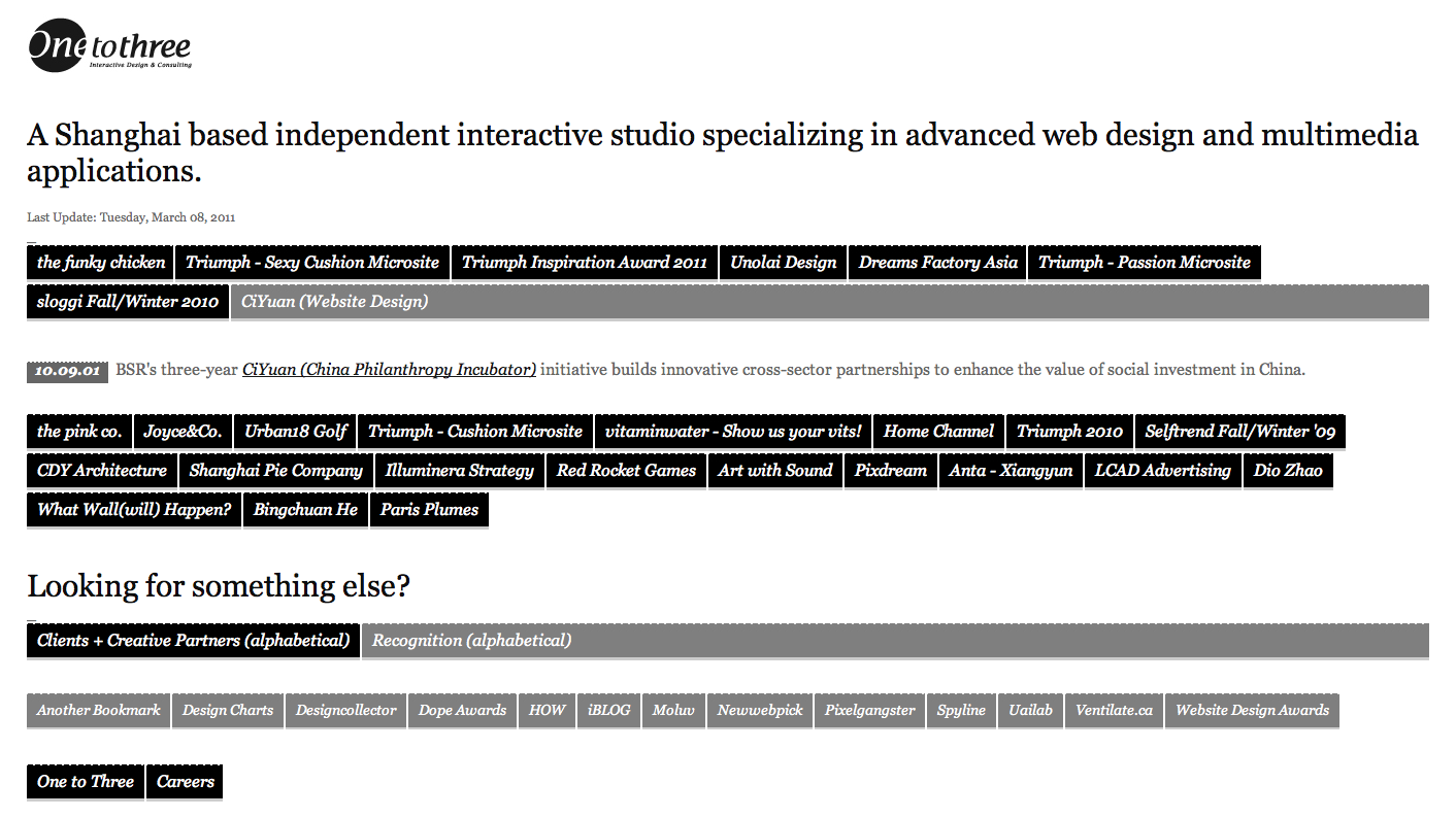
This last website onetothree. It is a Chinese's developing company. This page delivers access to their work through this block wall style that descends after a highlighted part is selected. I have never seen this before and it thought it was something different to share with the class.