The first site I want to include on our class blog is for
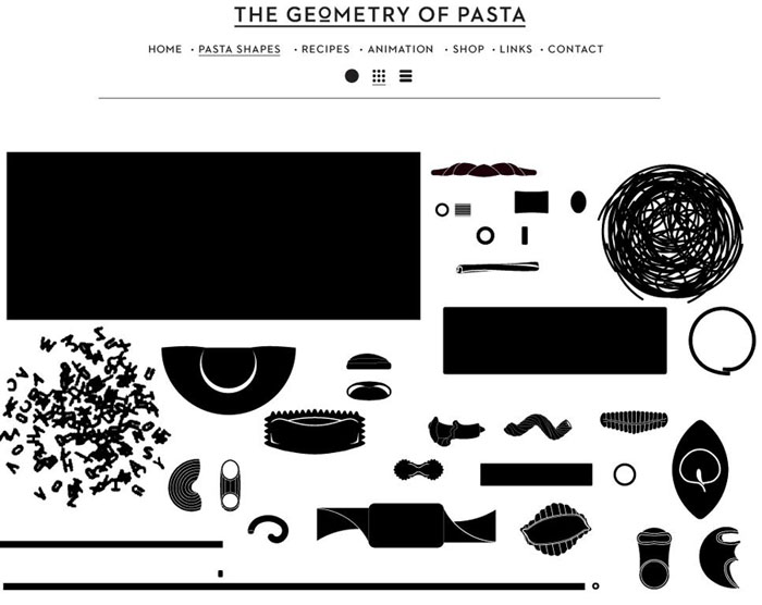
Geometry of Pasta.. I think this site works very well even though it is only black and white. There are 2 things I especially like:
- The page that has all of the different types of pasta on it- Each piece is clickable and takes you to information about that pasta type.
- The logo- Although it is an image and not styled with CSS, it is still an example of how we can add a variety of type to our web sites even though the type choices on the web are somewhat limited now.

The next site I want to talk about is
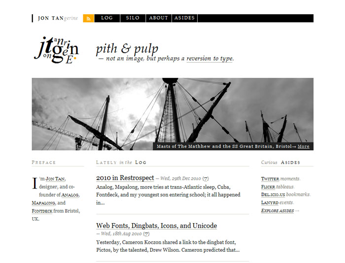
Jon Tangerine's site. I picked this site because I was inspired by his logo. It is just content and is completely styled with CSS. You might think that it is an image built somewhere else, but it is not. His logo inspired the way I handled the title in part B of project 1 for class.


