Nawlz site again
 WOW, I finally got it right.
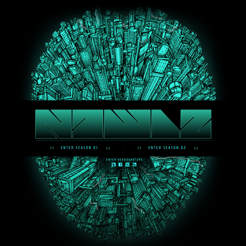
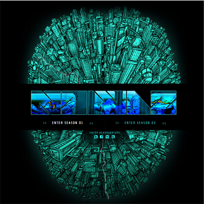
As I stated before, I chose this site for the way the type interacts with the images through out the site. Also the different font choices.
Here are a few more images from the site that shows the images through the text. This happens when you hover over the season selections in the main menu of the comic.
WOW, I finally got it right.
As I stated before, I chose this site for the way the type interacts with the images through out the site. Also the different font choices.
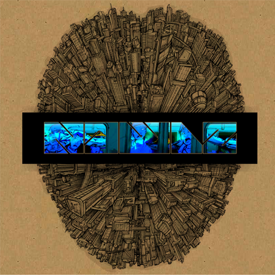
Here are a few more images from the site that shows the images through the text. This happens when you hover over the season selections in the main menu of the comic.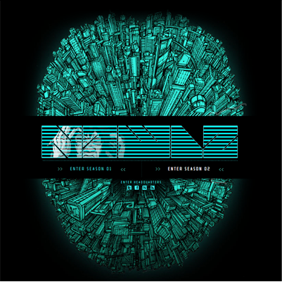
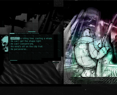
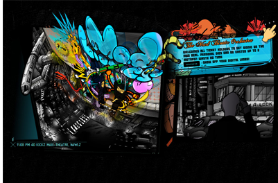
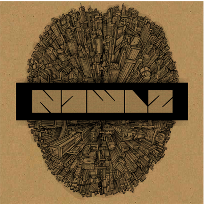
These last two are secondary screens inside the two different chapters.
And now here are some screen shots that show some of the different fonts used in the design of the site.