Part 7: Floats
Floats are especially useful in particular situations: (1) wrapping type around an image, (2) arranging a “gallery” of elements into horizontal rows, and (3) creating a multi-column layout (where you can re-use the container structure on many pages).
Although floats are hard to control at first, they are often the smartest choice when you need to maintain flexibility: a floated element remains part of the document flow, so content that follows a float is “aware” of its size and placement. This is not the case with absolute or fixed positioning.
Text wrapping
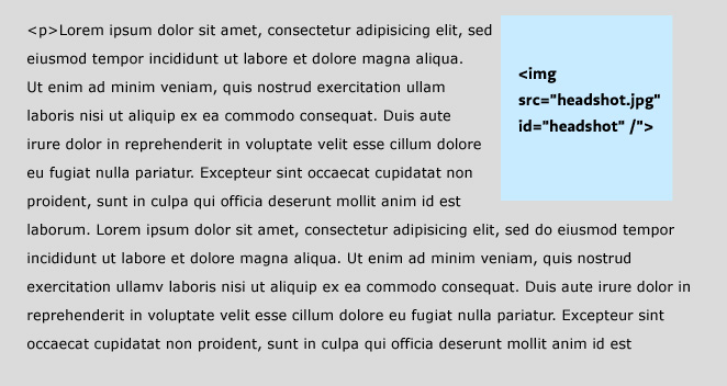
Suppose you have an image you want to wrap text around. First, put the image inside but at the beginning of the paragraph:
<p>
<img src="headshot.jpg" id="headshot" />
Lorem ipsum dolor sit amet, consectetur adipisicing elit,
sed eiusmod tempor incididunt ut labore et dolore magna aliqua.
Ut enim ad minim veniam, quis nostrud exercitation ullamv
laborisnisi ut aliquip ex ea commodo consequat. ...</p>
Then, with CSS, float the image right:
img#headshot {
	width:100px;
	float:right;
	}

By default, the text will wrap around your image.
Galleries
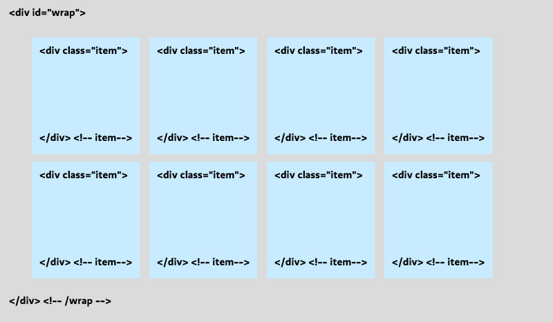
When you float an HTML element you are declaring that (a) it should go as far as possible to the left or right, and (b) that the elements that follow it should be pulled up next to it. This means we can apply a float to a whole class of items to create a gallery of items that flow into rows:

To achieve a layout like this, we write a rule that floats all the items (.item) to the left. It is always a good habit to declare a width on any element that you float: Internet Explorer will often mess up the layout without it. Notice that we also float the containing div (#wrap): this is especially necessary when styling the container with a background color or border. Without it, the container “collapses” to a height of zero because it contains only floated content, and your border turns into a flat line above the gallery.
#wrap {
	float:left; /* Float the container! */
	border:1px solid black;
	}
.item {
	float:left;
	width:100px;
	height:100px;
	background-color:#cbfeff; /*blue*/
	}
Multi-Column Layouts
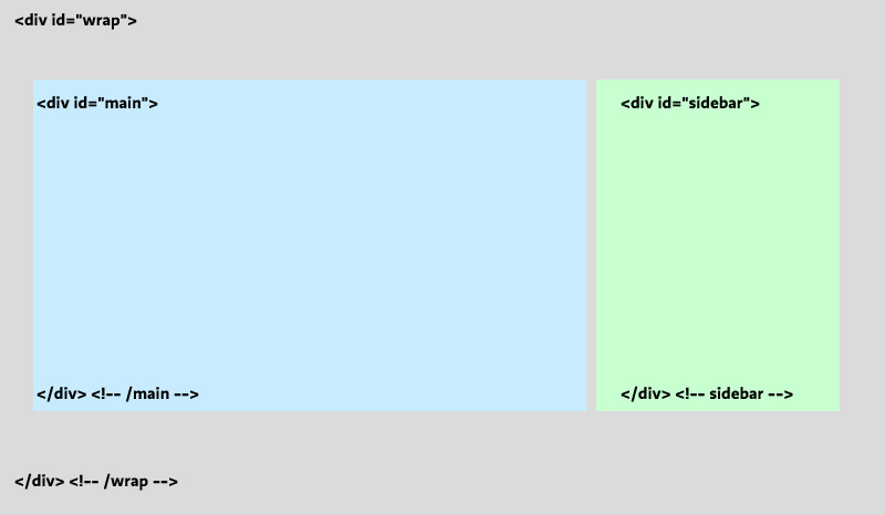
“Opposing” floats (one div floated left, the other right) are good for creating a structure of containers that stay put no matter what content you put in them. As long as you set a width on them, they will expand and contract vertically, sitting side by side no matter which column happens to contain more content. This means you can repeat the structure over a series of pages (linking all your pages to the same stylesheet), recycle the id names, and just change the content for each page.
Here is a simple pair of columns. Notice that we float the container again, float the child divs in opposite directions, and are sure to declare widths on everything.

#wrap {
	float:left; /* Float the container! */
	border:1px solid black;
	padding:70px 30px;
	width: 740px;
	}
#main {
	float:left;
	width:500px;
	background-color:#fff8ca; /*yellow*/
	}
#sidebar {
	float:right;
	width:220px;
	background-color:#cbfeff; /*blue*/
	}
Clearing
Floated elements have the annoying property of pulling up content that follows them, even when that content isn’t itself floated. To prevent this from happening, clear the float.
The clear property takes three possible values: left, right, or both. Most of the time (when you don’t need to distinguish between left- and right-floated elements), it’s simplest to just use clear:both;.
However, it usually doesn’t work to clear the elements you are floating: this prevents the float from working as intended. Instead, you want to clear whatever element follows the last floated element. For example, if you have a header that follows your gallery of floated images, target it with CSS and clear it.
h3 {clear:both;}
Now your heading will start on a new line as intended.
See also
- Exercises 3, 4, and 5
- CSS Floats, by Noah Stokes