Poorly Designed Websites
I decided to show some poorly designed websites for this show-and-tell. I just thought it would be a nice break from looking at all of the slick innovative designs that are normally shown. The first one is a definite eyesore. It's composed of so many different pages and all of them are equally horrid. Interestingly enough the dokimos site was the least vapid, but the most painful.
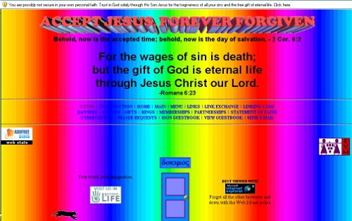
One thing about this site that really seemed strange to me was the door in the bottom center of the page. It takes you to the same place that the "menu" link takes you at the top navigation, but it restricts the use of pushing the back button to go back. This seems very manipulative to me as a user. One thing I actually do like about this site is the animated cat running backwards. Why backwards? It's completely absurd and that's why I enjoy it.

George Hutchins really needs to rethink his campaign plan. At least how it's represented on the internet. This site is just hideous. It's very difficult to read and leaves the user confused. Or at least it did me.
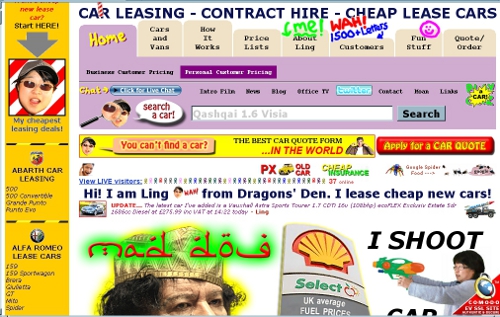
Ling has definitely got some cars... or does she/he? I can't tell. Maybe she's selling WMDs. Despite this hideous design I do enjoy the humour of the site.

I didn't show the timecube website in class because it's mostly text. However, I encourage you all to take a look and read through this insane philosophy, or as they like to call it, cube truth. It's filled with absurd notions of how the world really is and how it truely operates. It's a good laugh all around. Not to be slighted by flat earth or hollow earth theories.