Watkins Web 1

Part 6: Backgrounds

Backgrounds have many uses in CSS, from tinting the background color of a div to replacing normal HTML text with pre-designed graphics via background-image. Like the color property, the background-color property can take colors as words (red, yellow), hexadecimal codes (#ccc, #ffed8b), rgb values (rgb(128,0,128)), or rgba values ( rgba(128,0,128, 0.5)). With rgba, you specify an alpha value (transparency). This will only be recognized by modern browsers; see this 24 ways article for more details. If you’re only specifying a color, use the background-color property:

div#main {background-color:yellow;}

If you’re using background images, you have a lot more properties and values to specify. It’s generally easiest to use the shorthand background property, as long as you get the order of the values correct. The following two rules are equivalent:

div#main {
	background-color: transparent;
	background-attachment: scroll; /* 'fixed' is the other option */
	background-repeat: no-repeat;
	background-image: url(bg.png);
	background-position: 5px 10px;
	}
div#main {background: transparent url(bg.png) no-repeat 5px 10px;}

Background images get cropped according to the calculated size of the HTML element to which they’ve been applied: in other words, a large image does not force its corresponding HTML element to expand. If you need your element to be bigger to show the whole background image, just force it to expand by setting an explicit width and height on your element:

p#infobox	{
	background: transparent url(huge-info-icon.png) no-repeat 10px 10px;
	width:200px;
	height:500px;
	}

Part 5: Advanced Selectors

Writing efficient CSS means being smart about your selectors. Here are some of the most useful techniques.

Select a series of HTML elements using comma-separated selectors

/* Make the headers, lists, and paragraphs 
the same font size */
h1, h2, h3, p, ul, ol {
	font-size: 10px;
	}

Use descendent selectors to apply different styling to elements based on their container

For example, let’s remove bullets from our navigation list but make them circles on our content’s bulleted lists.

/* Select unordered lists inside the NAVIGATION div */
div#nav ul {list-style:none;}
/* Select unordered lists inside the MAIN div */
div#main ul {list-style-type:circle;}

Create a “current” class to highlight a particular navigation item on a page

/* Make the current navigation item black 
instead of the default blue */
#nav li.current a {color:black;}

Just make sure to move the class to the corresponding list item on each page. The home page should look contain code that looks like this:

<ul id="nav">
	<li class="current"><a href="home.html">Home</a></li>
	<li><a href="about.html">About</a></li>
	<li><a href="contact.html">Contact</a></li>
</ul>

while the about page should look like this:

<ul id="nav">
	<li><a href="home.html">Home</a></li>
	<li class="current"><a href="about.html">About</a></li>
	<li><a href="contact.html">Contact</a></li>
</ul>

Highlight the current navigation item without changing your HTML

You can even achieve this same effect without the special class: instead, apply a page-identifying id to your body tag, give each navigation item its own id, and then use descendent selectors to apply the style selectively. Your HTML would look something like:

<!-- Navigation -->
<body id="home">
...
<ul>
	<li id="nav-home"><a href="#">Home</a></li>
	<li id="nav-about"><a href="#">About</a></li>
	<li id="nav-port"><a href="#">Portfolio</a></li>
</ul>

and it would work in conjunction with this CSS:

/* Make the current navigation item black by checking 
the id on the body tag; then apply the rule only 
to the corresponding navigation item */
body#home li#nav-home a,
body#about li#nav-about a,
body#port li#nav-port a
 {color:black;}

The main advantage of this technique is that you can copy and paste your navigation code between pages without changing anything. The disadvantage is that you must anticipate all the navigation possibilities in advance — if you go back and add a new navigation item to the HTML, you have to update the rule in your CSS too.

Part 4: Classes, IDs, Selectors

Classes vs. IDs

Classes and attributes should first be understood as attributes that you add to HTML entities – they just happen to be particularly useful as targets of CSS selectors. So you might change <p>Some content</p> to <p id="footer">Some content</p> so that you can style it a particular way.

The point of IDs is that they are unique identifiers for a particular HTML entity. Therefore, they only be used once on a page. If you want to create a set of things to be styled the same way, use a class: you could have <p class="infobox">Welcome to my site</p> near the top of the page and then <p class="infobox">Check out my other website...</p> further down the page.

CSS Selectors

Pay careful attention to the use of spaces: they indicate a descendent selector. p#special refers to the HTML element <p id="special">, but p #footer (with a space after the p) refers to “anything with an id of special inside a paragraph.” For example, the span inside <p>Some content <span id="special">some nested content<span></p>

This table summarizes the most common ways to style elements using IDs, classes, and descendent selectors:

What we want to style HTML CSS Rule
All paragraphs <p>Sample</p> p {color:red;}
All paragraphs with a class of special <p class="special">Sample</p> p.special {color:red;}
The (only) paragraph with an id of first <p id="first">Sample</p> p#first {color:red;}
Anything with a class of warning <p class="warning">Sample</p>, but also <ul class="warning">, <div class="warning">, etc., if they exist. .warning {color:red;}
Paragraphs nested inside the maincontent div <div id="maincontent"><p>Sample</p></div> div#maincontent p {color:red;}
List items nested inside unordered lists that have a class of ingredients <ul class="ingredients"><li>Sample</li></ul> ul.ingredients li {color:red;}

Part 3: The Box Model

Every HTML tag can be understood as a box with a particular height, width, margins, and padding. The CSS “box model” is how we control the size and arrangement of HTML elements on the page.

Box Model diagram

Remember that things like padding, margins, and borders are added to any width or height you’ve specified, making the total width or height larger. A div set to width:420px; will not fit in a 420 pixel space if it also has positive margin, padding, or borders assigned to it.

The total space occupied by an element follows these rules:
total width = width + padding-left + padding-right + margin-right + margin-left + border-left + border-right
total height = height + padding-top + padding-bottom + margin-top + margin-bottom + border-top + border-bottom

Part 2: CSS Fundamentals

CSS rules always follow the format below (watch your colons and semicolons). Note that multi-word properties are always hyphenated, while multiple values are separated by spaces (e.g. margin:0 10px;).

selector	{
	property: value;
	some-other-property: value1 value2;
	}

At the top of your stylesheet, you’ll want to use a CSS Reset. There are various versions, but a simple one is this:
body * {margin:0; padding:0; border:none;text-indent:0;text-decoration: none;outline:none;}

Margins

Margins push the object away from other objects. Like other CSS measurements, you can specify the margin amount in pixels (px), points (pt), percentages (%), or ems (em). Note that margins can also take the auto value: the most common use is to horizontally center a fixed-width content div by writing div#content {margin:0 auto;}

Be sure to take advantage of the “shorthand” versions of CSS declarations to avoid repetitive typing. The following three rules are equivalent:

p 	{
	margin-top:5px;
	margin-right:10px;
	margin-bottom:5px;
	margin-left:10px;
	}
p	{margin:5px 10px 5px 10px;}
p	{margin:5px 10px;}

Padding

Padding creates space inside the element, extending its background color and its borders (if any). There is no auto value for padding. Padding is useful for creating breathing room around an element, especially if it has backgrounds or borders applied.

Borders

Rules for borders follow similar patterns, and you can specify values for color, width, and style (solid, dotted, or dashed). The following two rules are equivalent:

p	{
	border-width: 2px;
	border-style:dotted;
	border-color:red;
	}
p {border: 2px dotted red;}

Part 1: HTML Fundamentals

Tags and Attributes

The point of HTML markup is to communicate the structure or semantics of the content on your page through headings, paragraphs, lists, hypertext links, etc. While we may have to bend this rule every so often, HTML should not be used to effect a particular visual presentation: that’s the job of CSS.

Most tags are paired (<p>some content</p>), but a few are “self-closing,” like the break tag (<br />) and the image tag (<img src="photo.jpg" />). Any tag can have an attribute, which might be essential to its working at all (the src attribute in <img src="photo.jpg" />), or might only be useful in conjunction with CSS (the id attribute in <p id="footer">some content</p>). Note that this syntax is consistent across all tags: <tag attribute="value" otherattribute="othervalue">some content</tag>.

Typography

Straight HTML text is limited to the ASCII character set. Therefore you should use typographic entities to create “smart” quotes, en and em dashes, ampersands, fractions, etc. You can speed up this process by running your text through a markup generator like Textile or Markdown. Other typographic tricks include using a non-breaking space before the last word in a paragraph (this will prevent that word from ending up alone on the last line) and adding a <span class="caps"> around acronyms (you can then globally letter-space and reduce the font-size of span.caps with CSS).

Project 2 Final Details

Submitting and Archiving

  • Project 2 is due in class on Monday, April 4.
  • As with Project 1, please be ready to copy your files onto my flash drive. Name your files index.html and style.css and make sure they are working together. If you have a multi-page site, just make sure the home page is called index.html. Then put your files in a folder called lastname-project2.

Criteria for Grading

As we’ve discussed, Project 2 requires that you wrangle text and/or images in order to communicate information in a systematic way, preferably one that takes advantage of the natural properties of web pages: scrolling, linking, hovers, etc. Whether you are doing a straightforward résumé, an infographic, a mini-biography, or some hybrid of all of those things, please keep the following in mind:

  • The fundamentals of typography and communication design in general still matter! Please check your spelling and grammar, use HTML entities for apostrophes, dashes, etc., and be deliberate about your typographic and layout choices. Use Textile if you’d like.
  • Finally, do your best to write your final XHTML and CSS efficiently — where possible, use techniques that we’ve reviewed in class, like opposing floats, to create a robust grid design, or descendent selectors, to reduce the amount of redundancy in your stylesheet.

I’m looking forward to seeing the final version of your work. Good luck!

Show and Tell

Here is a site I found to be creative. It acts as a kind of resume for Jim Carrey, yet it chooses to show his experience rather than list it. Items on the page can be clicked and will animate with sound from different movies he played in. Also clicking the bird twitter.

Dropbox

Dropbox logo 
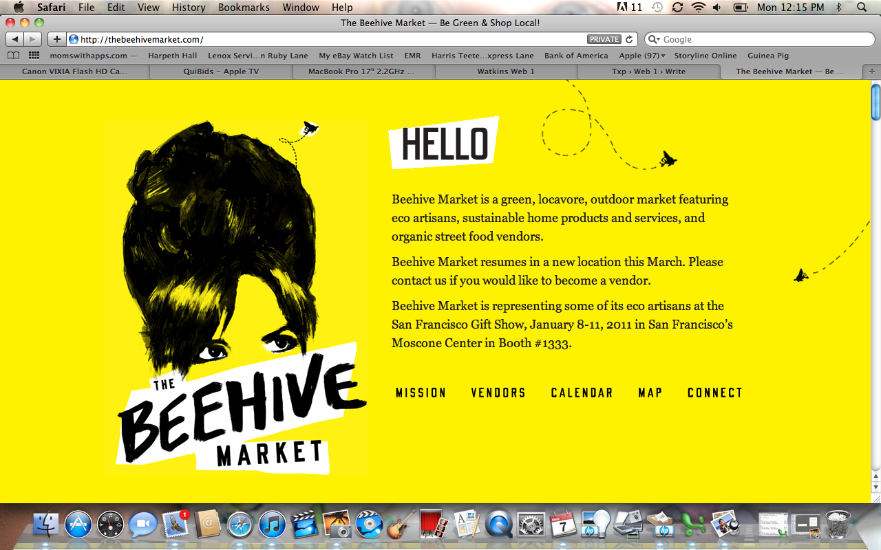
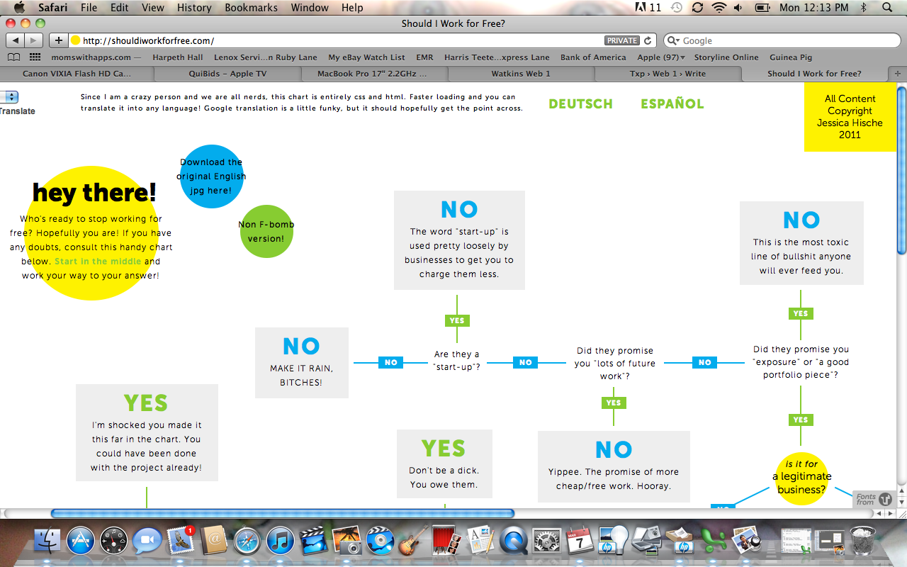
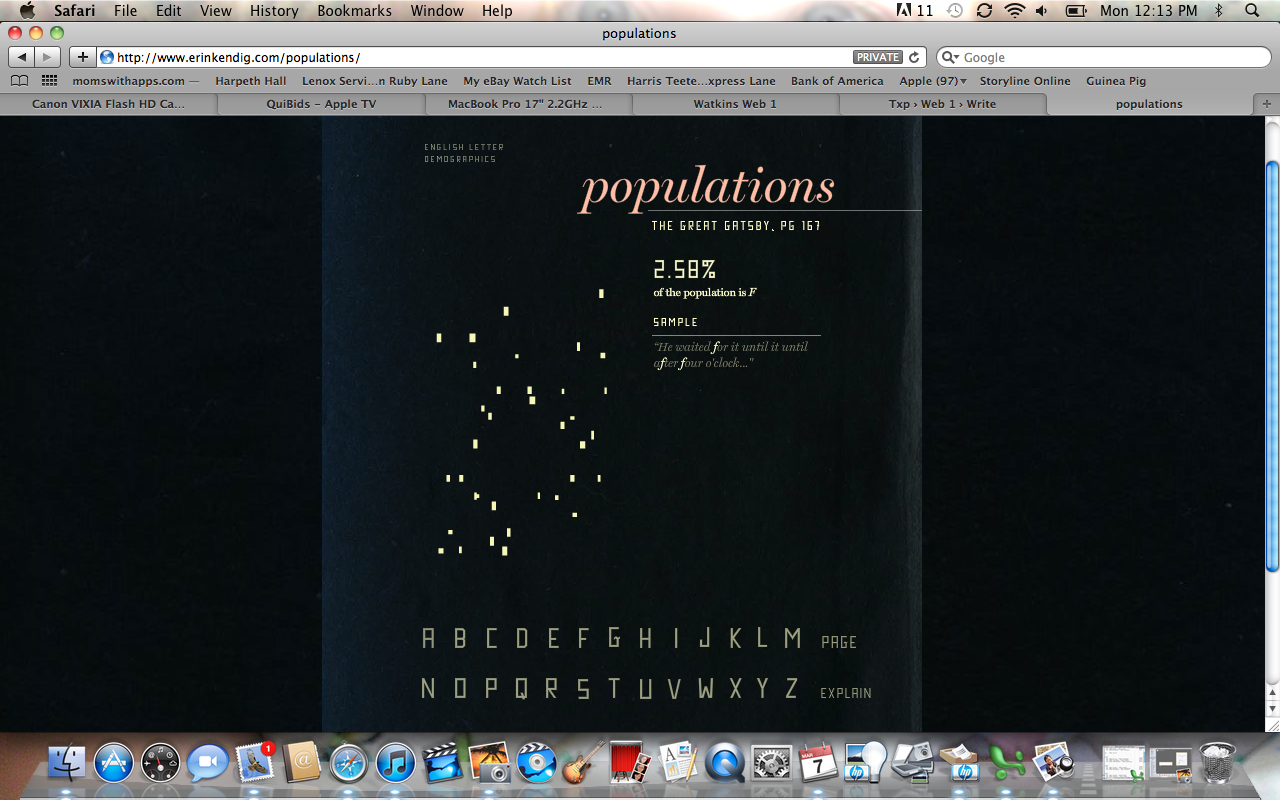
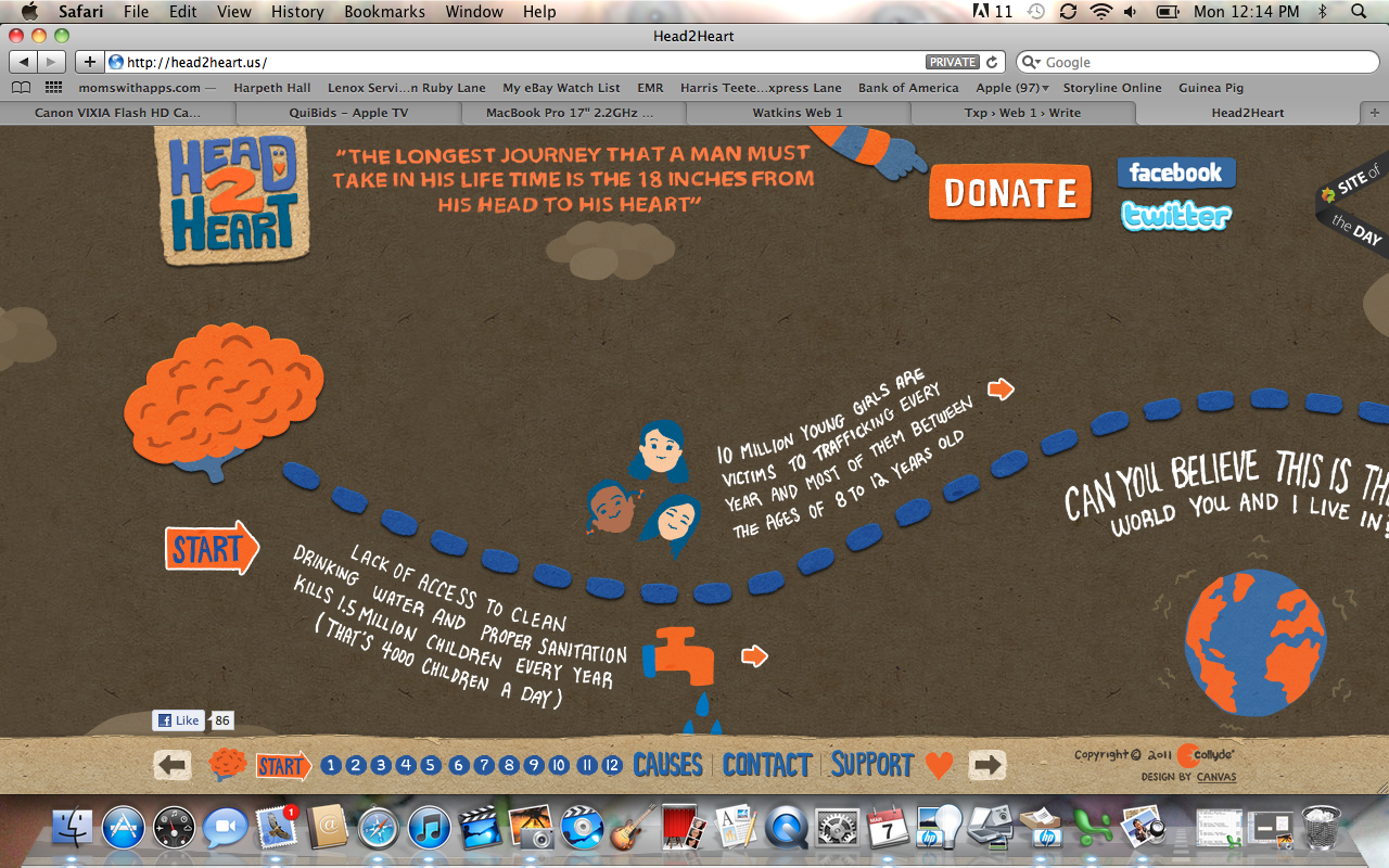
If you haven’t tried it, take a look at Dropbox. Installing the software adds a special folder to your Mac or PC: put your files in it and it works like a regular folder, except it also backs them up to the web. So that means you can retrieve those files with just a web browser from another computer. It does other backup, syncing, and mobile tricks, but that’s the main idea. The free account gets you 2 GB.

Exercises 12, 13, 14 (Review)

These three exercises touch on floats, positioning, background images, and descendent selectors. Download the files and get started.

April Mueller

If you’re still refining the idea behind your Project 2, take a look at April Mueller’s about page. This is an image, not a web page, but it shows a nice, visual approach to a page that combines a résumé and funny biography.

April Mueller - about page

Show and Tell

Screenshot from http://www.the-m-factor.com/html/home.html

Screenshot from http://www.the-m-factor.com/html/home.html

This first website is The-M-Factor. It is great for this project because it used a method where the diagram of the guns have a background image with the lines on it and then the text is positioned around the photo. It was a great technique and something that I think I can achieve.

Screenshot from http://www.fredrikclement.com/

Screenshot from http://www.fredrikclement.com/

Screenshot from http://www.fredrikclement.com/

This second website Fredrik Clement. I thought this was a very interesting website because it not only scrolls up and down but side to side. This is the portfolio of a photographer and you can tell that the main focus is his images. I think it works really well for his purpose.

http://www.onetothree.net/

http://www.onetothree.net/m

This last website onetothree. It is a Chinese's developing company. This page delivers access to their work through this block wall style that descends after a highlighted part is selected. I have never seen this before and it thought it was something different to share with the class.

Two articles on Floats and Positioning

Please read the following over break in addition to working on your projects:

kelsey show & tell

Again, this site is very simple as well. I really liked how the format was meant to be used only horizontally. The browser only allows you to scroll in one direction.

kelsey show & tell

Despresso

I really liked the minimialistic style of this site. It advertises a coffee shop in NYC. I feel it's very basic, yet memorable. It gives you the information up front and is very brief. I think that is something very benefical to websites when its very basic versus being too busy and overwhelming.

The Beehive Market

This site is for a farmers market in the Bay area. The links could have their own page address to make it easier to share info. If you wanted to send the directions, they would not have to scroll.

A bright informational site for a seasonal market.

Should I Work For Free

This site is written only in CSS and HTML. You may move the page around easily. Very few links. It translates relatively the same into other languages.

A site only in CSS and HTML.

Tennessee Vacation

This is a tourism site for Tennessee. Very busy. If you search for a place to stay by zip code, you may not find a close address quickly. Places are listed alphabetically in the state.

A tourism site for Tennessee.

Erin Kendig - Populations

She uses an info graphic to show the populations of letters from one page of the Great Gatsby.

A website showing populations of letters on a given page.

Heart 2 Heart

A fundraising site recruiting money and designers. It moves horizontally and requires some interaction. The arrows could be larger to click.

A fundraising site which adds interaction to read content.