Watkins Web 1

Part 8: Positioning

Sometimes floats aren’t enough to create a complex layout. Specifically, position:absolute, position:relative, and position:fixed enable positioning according to a coordinate system and allow elements to be “attached” to the browser.

Absolute Positioning

Before you absolutely position an element, you should understand that it will be removed from the regular document flow: that means that elements that come after it in the HTML source don’t “know” how much space the positioned element takes up, even if you’ve specified a particular height and width. Sometimes you can compensate for this issue by adding margins or padding to the later elements, but doing so relies on the positioned element never changing size or having content added to it.

Positioning

By the same token, though, position:absolute; is particularly useful for overlapping one piece of content over another. The element you position will be removed from the document flow and moved to a point according to the pixel coordinates you assign. By default, those coordinates are measured from the top left corner of the browser.

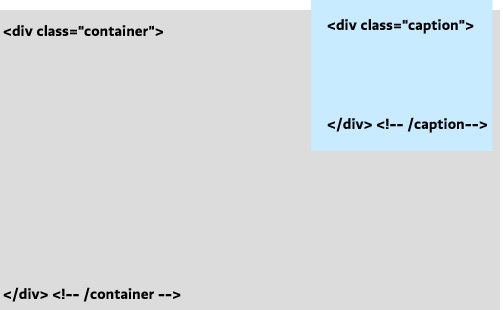
Suppose you have the following HTML, and you want to overlay your caption in the upper-right corner of the image.

<div class="container">
	<img src="cats.png" alt="My cats" />
<div class="caption">
	<p>My cats</p>
</div> <!--/caption -->
</div> <!-- /container -->

We’ll write a rule that positions the caption in the upper-right corner of the image. The position property is almost always accompanied by the top (or bottom) and left (or right) properties. These are distinct from margin-top and margin-left, and they default to 0.

.caption {
	position:absolute;
	right: 10px;
	top:-10px;
	}

Relative Positioning

Relative positioning works like absolute positioning, with two important differences: (1) the element is positioned according to the location the element would have been placed in regular document flow, and (2) the element’s height and width are preserved as if the element hadn’t been moved.

This sounds more useful than it is. Most often you will want to use another quirk of relative positioning: setting it on a container of an absolutely-positioned element resets the coordinate “origin” (zero point) to that relatively-positioned element’s top-left corner. This quirk is true for all three kinds of “positioning” that are not the default normal flow, but position:relative; is unique in that it won’t monkey with your container in any other way.

So in our example, we set the container to position:relative;, which has the consequence will then mean that our absolute positioning of the (child) caption will always be in relationship to its container, no matter where that container happens to be on the page.

.container {
	position:relative;
	}
.caption {
	position:absolute;
	right: 10px;
	top:-10px;
	}

Now we can be recycle the container and caption classes many times over on the page, knowing that each caption will always be positioned according to its container’s position.

Fixed Positioning

Fixed positioning positions an element according to the browser window, removing it from the document flow and keeping it there no matter where the user scrolls. It’s often useful for navigation bars, toolbars, or masthead elements that you want to stay on the screen. (Note that mobile Safari — the iPhone’s browser — does not support fixed positioning. Instead, it treats it like absolute positioning).

position:fixed is fairly simple to use, since it doesn’t matter where the element is nested in the source HTML or what comes before or after it:

#menu {
	position:fixed;
	bottom:20px;
	left:20px;
	}

Further Reading

Part 7: Floats

Floats are especially useful in particular situations: (1) wrapping type around an image, (2) arranging a “gallery” of elements into horizontal rows, and (3) creating a multi-column layout (where you can re-use the container structure on many pages).

Although floats are hard to control at first, they are often the smartest choice when you need to maintain flexibility: a floated element remains part of the document flow, so content that follows a float is “aware” of its size and placement. This is not the case with absolute or fixed positioning.

Text wrapping

Suppose you have an image you want to wrap text around. First, put the image inside but at the beginning of the paragraph:

<p>
<img src="headshot.jpg" id="headshot" /> 
Lorem ipsum dolor sit amet, consectetur adipisicing elit, 
sed eiusmod tempor incididunt ut labore et dolore magna aliqua. 
Ut enim ad minim veniam, quis nostrud exercitation ullamv 
laborisnisi ut aliquip ex ea commodo consequat. ...</p>

Then, with CSS, float the image right:

img#headshot {
	width:100px;
	float:right;
	}

Text Wrap

By default, the text will wrap around your image.

Galleries

When you float an HTML element you are declaring that (a) it should go as far as possible to the left or right, and (b) that the elements that follow it should be pulled up next to it. This means we can apply a float to a whole class of items to create a gallery of items that flow into rows:

Gallery

To achieve a layout like this, we write a rule that floats all the items (.item) to the left. It is always a good habit to declare a width on any element that you float: Internet Explorer will often mess up the layout without it. Notice that we also float the containing div (#wrap): this is especially necessary when styling the container with a background color or border. Without it, the container “collapses” to a height of zero because it contains only floated content, and your border turns into a flat line above the gallery.

#wrap {
	float:left; /* Float the container! */
	border:1px solid black;
	}
.item {
	float:left; 
	width:100px; 
	height:100px;
	background-color:#cbfeff; /*blue*/
	}

Multi-Column Layouts

“Opposing” floats (one div floated left, the other right) are good for creating a structure of containers that stay put no matter what content you put in them. As long as you set a width on them, they will expand and contract vertically, sitting side by side no matter which column happens to contain more content. This means you can repeat the structure over a series of pages (linking all your pages to the same stylesheet), recycle the id names, and just change the content for each page.

Here is a simple pair of columns. Notice that we float the container again, float the child divs in opposite directions, and are sure to declare widths on everything.

Columns

#wrap {
	float:left; /* Float the container! */
	border:1px solid black;
	padding:70px 30px;
	width: 740px; 
	}
#main {
	float:left; 
	width:500px; 
	background-color:#fff8ca; /*yellow*/
	}
#sidebar {
	float:right; 
	width:220px; 
	background-color:#cbfeff; /*blue*/
	}

Clearing

Floated elements have the annoying property of pulling up content that follows them, even when that content isn’t itself floated. To prevent this from happening, clear the float.

The clear property takes three possible values: left, right, or both. Most of the time (when you don’t need to distinguish between left- and right-floated elements), it’s simplest to just use clear:both;.

However, it usually doesn’t work to clear the elements you are floating: this prevents the float from working as intended. Instead, you want to clear whatever element follows the last floated element. For example, if you have a header that follows your gallery of floated images, target it with CSS and clear it.

h3 {clear:both;}

Now your heading will start on a new line as intended.

See also

Poorly Designed Websites

I decided to show some poorly designed websites for this show-and-tell. I just thought it would be a nice break from looking at all of the slick innovative designs that are normally shown. The first one is a definite eyesore. It's composed of so many different pages and all of them are equally horrid. Interestingly enough the dokimos site was the least vapid, but the most painful.

One thing about this site that really seemed strange to me was the door in the bottom center of the page. It takes you to the same place that the "menu" link takes you at the top navigation, but it restricts the use of pushing the back button to go back. This seems very manipulative to me as a user. One thing I actually do like about this site is the animated cat running backwards. Why backwards? It's completely absurd and that's why I enjoy it.

George Hutchins really needs to rethink his campaign plan. At least how it's represented on the internet. This site is just hideous. It's very difficult to read and leaves the user confused. Or at least it did me.

Ling has definitely got some cars... or does she/he? I can't tell. Maybe she's selling WMDs. Despite this hideous design I do enjoy the humour of the site.

I didn't show the timecube website in class because it's mostly text. However, I encourage you all to take a look and read through this insane philosophy, or as they like to call it, cube truth. It's filled with absurd notions of how the world really is and how it truely operates. It's a good laugh all around. Not to be slighted by flat earth or hollow earth theories.

Dollar Dreadful books

Dollar Dreadful Books, the book pages are set in very nice typefaces and rendered as PDFs.

CSA Design

Charles Spencer Anderson's web site, an award winning designer

Two paper dolls, want ad

Two paper dolls, want ad, nice and clean web page

twopaperdolls want ad

Reading on CSS Transformations and Responsive Design

Hi everyone. Nice work on the flexible layouts tonight. For Monday the 18th, please continue to work on Project 3. Also read the following for more perspective on the techniques we covered this week:

CSS3

Responsive Design

Exercise 18 (Responsive Design)

Hi everyone, I won’t be able to make it to class tonight until around 7:30pm. Please try out the exercise below and see how far you can get with creating a flexible layout. If you get stuck or the instructions don’t make sense, get started on Project 3. Thanks and see you soon.

Download Exercise 18.

Exercise 17 (CSS3)

Please download Exercise 17

Here’s the scaling code I forget to include: it’s only for the last thumbnail in the gallery:

   -webkit-transform: scale(1.2);
   -moz-transform: scale(1.2);
   -o-transform: scale(1.2);
   transform: scale(1.2);

CapitalHillBlue.com

This is another website for political junkies, but one that's very cluttered and busy.

This is a website I check in regularly to, being the political junkie that I am. However, I find its design cluttered, frenetic, and too busy. See if you agree... www.capitolhillblue.com

Counterpunch.org

This is a liberal political website with very basic web and graphic design.

Here's another of the political websites I showed during class. It goes the other way from Capitolhill.blue... It's so plain and simple in design it's almost boring. Check it out: Counterpunch.org

Save Our Website

Save as PDF

I made a new page template that outputs all the posts to the website in chronological order (instead of reverse chrono).

If you hit print and then Save as PDF (on the mac), you have an archive of all the posts (you could do this on a per-post basis too).

PDF Screenshot

Printing to a printer or to PDF will pick up a print stylesheet I just added. It uses some techniques we can go over in class. For example, any links have their URLs printed out in parentheses after the link, so they are still maintained when looking at a printout.

Project 3 Inspiration

Option 1 (online exhibit)

Option 2 (personal portfolio)

Web sites for Okapi and StuffandNonsense

The first web site I selected is from Stuff And Nonsense Web site Design Studio. I selected it because it talked about and reflected a lot of things we have been studying in class about making web sites attractive and readable across multiple browsers.

There are also specific details about the site that I like:

  1. On the Work page, I like that although the projects are stacked on top of each other, pieces of the images overlap with other projects. I feel that this keeps the layout from being too sterile.
  2. Their Blog has a lightly different layout from other blogs. The column widths are mixed up a little, so that the widest column is not in the middle.
  3. They have injected some additional humor into the site by making the Help section multi-level. It's funny, but at the same time serious, because there ARE people who have very very little knowledge of the internet.
There are also a few things that I did NOT like:
  1. I was a little confused by which images were supposed to enlarge upon clicking and which were supposed to take me to another page. There did not seem to be a pattern.
  2. The text wrap on some of their Work pages was a little awkward or text color blended into the background image and made it difficult to read,

www.stuffandnonsense.co.uk

The next web site that I selected was for Okapi Creative Agency. Although the website was more subdued and not as interesting in its choice of colors and images, I thought it was a very good example of organizing information in a clean, easy to understand way. I was confused by the fact that their return buttons looked like broken links, and their list of clients was not clickable, but overall I think it is an elegant, attractive site.

www.okapidev.com

Show and Tell - Final Schedule

Here’s the schedule: after these, everyone should have shown and told twice. Remember, your posts (screenshots, commentary) are due a week from the date of your showing and telling. Thanks.

4/11 adam, courtney
4/13 eric, richard
4/18 mark, kelsey
4/20 steve
4/25 (critique)
4/27 (critique)
5/02
5/04

Exercise 16 (jQuery)

Please download Exercise 16 to your machines. Good luck!

Don Mann

With all three of the websites I posted, I thought these were the best in my opinion. I don't want to talk too much about it because I think the sites speak for themselves. They're great. Better than sliced wheat/white bread.

WhatFont

WhatFont Screenshot

As you browse websites, you may want to know what fonts are being used without going to the trouble of viewing the site’s entire CSS file. So take a look at WhatFont.

First, drag the bookmarklet to your bookmarks bar. Then, when you’re on any website, click the bookmarklet and hover over any text on the page.

Exercise 15 (Flexible layouts + navigation icons)

Download Exercise 15

Project 3

Here’s Option 1 from from the syllabus:

Create a small web site (one to five pages) that showcases the development of a recent art/design/film project, preferably your own. Walk the visitor through sketches, the process of creating the work, inspirational sources, and commentary. Prioritize creating interesting and relevant site and page structures, rather than applying heavy styling. Balance the consistency and variety of the pages so that the site has a distinct identity without feeling monotonous.

What can you do to create multiply pathways through the material, instead of forcing your audience into a linear slideshow? Take advantage of the medium and attempt to tell your story in ways that would not be possible in print. If you can, incorporate light programming to add modularity, dynamic elements, or user contributions to your site.

Note: I should emphasize that the work you exhibit does not have to be your own. If you want to create a site all about an architectural project, a piece of music, a renaissance painting, or your favorite comic book, go for it. What matters most is that (a) you have access to (or can quickly create) visual material that shows the process by which the work came into being, and (b) you know enough about the work that you can convincingly guide your audience through the material.

I’m also adding Option 2:

If you have started a personal website with Project 2, go ahead and complete it for Project 3. The site should include your résumé and or bio (refined, if necessary) and serve as a portfolio for your art or design work. While a clear structure and logical navigation are important, you should also strive to create a site that reflects your own design or art sensibilities. In other words, don’t make something so generic it could just as easily be applied to another artist. Additional sections are encouraged: essays, links to other sites, etc.