James Muspratt
James Muspratt
Jan 19, 2011
Class Syllabus
Here’s the final class syllabus. Please note that the calendar portion is for planning purposes and is subject to change.
James Muspratt
Jan 19, 2011
Exercise 1
Here’s Exercise 1, which we went over on January 19.
James Muspratt
Jan 20, 2011
Required Books
These are the two required books for the class:
James Muspratt
Jan 22, 2011
Online Reading, Weeks 1-5
- Understanding Web Design, by Jeffrey Zeldman
- On Web Typography, by Jason Santa Maria
- Setting Type on the Web to a Baseline Grid, by Wilson Miner
- Five Simple Steps to Better Typography, by Mark Boulton
James Muspratt
Jan 22, 2011
Project 1
Choose two texts from the printed world, preferably ones that you know well. Text A should have a relatively flat prose structure (e.g. essay, manifesto, book chapter), while Text B should be more complex (e.g. recipe, instructions, interview, screenplay excerpt). Your assignment is to mark up the raw texts as semantic HTML and then typeset them using CSS.
For both texts, you should design the text in a way that responds to its content. Consider the relationships of your page’s elements in terms of classical typography: margins, measure, leading (line-height), and conventions like indents, drop-caps, and horizontal rules. Consider how your typography can be used to enhance, comment on, or perhaps undermine the text’s meaning.
Due Date: February 16, in class
James Muspratt
Jan 24, 2011
Reading for January 26
Hi everyone. Here are the two pieces you should read for Wednesday, January 26.
- Understanding Web Design, by Jeffrey Zeldman
- On Web Typography, by Jason Santa Maria
James Muspratt
Jan 24, 2011
James Muspratt
Jan 24, 2011
James Muspratt
Jan 25, 2011
HTML Entities and Examples
Some resources that should help with Project 1:
James Muspratt
Jan 25, 2011
Font Stacks
Remember with normal CSS you can only set type in fonts that are on the user’s computer. Here are two sites that might help you all with choosing fonts:
- Web Safe Fonts, a great chart that tells you how likely it is a given font will be available on the user’s computer.
- Font Matrix, showing the fonts bundled with Mac and Windows, Microsoft Office and Adobe Creative Suite.
James Muspratt
Jan 26, 2011
Reading for January 31
Hi everyone, nice work tonight getting going on your texts. Here is your assignment for Monday, January 31.
- Continue working on Project 1. Read The Elements of Typographic Style Applied to the Web and apply it to your text wherever you think it is relevant.
- Read Zeldman Chapters 3 and 8 (also Chapter 2 if you haven't read it yet)
James Muspratt
Jan 26, 2011
More about RSS
For those of you interested in learning more about RSS, here are a few feed readers to try:
- Net Newswire (for Mac, iPhone, iPad)
- Vienna (Mac)
- Reeder (for Mac, iPhone, iPad)
- Google Reader (web-based)
And remember, the feed for this site is http://web1.jamesmuspratt.com/rss/. Copy and paste this link into your feed reader to subscribe. Safari and Firefox will also track RSS feeds, but they don't make as much sense (to me) as the software above.
Update: Katelyn points out that you can use Mac Mail to read RSS feeds, too.
James Muspratt
Jan 27, 2011
Show and tell schedule
Here is the schedule for the next few weeks for show and tell:
- Jan 31: Katelyn, Don
- Feb 2: Xavier
- Feb 7: Rex, Courtney
- Feb 9: Jill
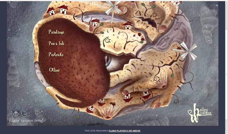
Aaron Johnson
Jan 28, 2011
Website show and tell; www.sonnyt.com
Online Portfolio of Sonny Tulyaganov
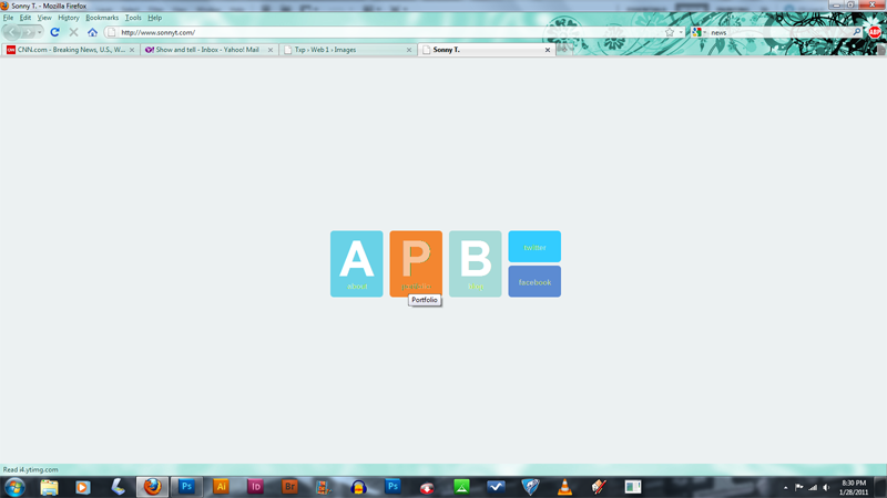
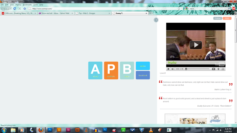
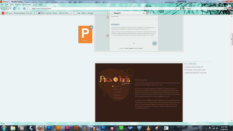
I found this site interesting because it accomplishes many of the same effects as a flash site, yet uses no flash at all. The buttons animate when clicked and bring up an interface that lets you scroll down through his portfolio. All the animations have a delay on them, which is neat at first but gets tedious when navigating through the different pages. It's just a simple portfolio site and there are only three main pages though so perhaps it isn't meant to be viewed more than once.
The layout is interesting and minimalistic, which is typical of many modern portfolio sites. It utilizes a continuous long page that you scroll down to display his portfolio pieces, which cuts down on the amount of clicking and simplifies navigation. Interesting to note is that he seems to have embedded his blog into the site as well. Perhaps this utilizes RSS in some way to recreate the blog, rather than making an actual portal to another site.
James Muspratt
Jan 31, 2011
CSS Reset
It is almost always a good idea to put a CSS reset at the top of your stylesheet. This clears all of the default spacing and style values that a browser would normally add, and means the rules you right will get the expected results more often.
/* Reset the browser defaults on everything */
body * {margin:0; padding:0; border:none; text-indent:0; text-decoration: none; outline:none;}
Steve Womack
Jan 31, 2011
A Good Resource & Tutorial
I was googling around trying to get some specifics on certain CSS terms and syntax and found a great tutorial site. I found it very useful.
Steve
James Muspratt
Jan 31, 2011
Web Typography
Here are the Web Typography Slides from tonight. I guess the URLs of the sites (below each screenshot) are only clickable if you open the PDF using a recent version of Preview for Mac (not Acrobat).
James Muspratt
Jan 31, 2011
Critique Wednesday
Please remember we will be doing a mid-project critique of the work of Group A on Wednesday. Bring in the current state of both texts and be prepared to describe your intentions for the design, as well as questions you have for the group.
- Group A
- Adam Agee
- Eric Andre
- Richard Cook
- Mark Fentriss
- Adam Filer
- Karissa Goff
- Aaron Johnson
- Katelyn Joughin
- Group B
- Don Mann
- Xavier Payne
- Rex Runyeon
- Courtney Spencer
- Jill Thompson
- Kelsey Ullrich
- Steve Womack
James Muspratt
Jan 31, 2011
HTML and CSS References
A few of you were asking if there is a single list somewhere of common CSS properties and HTML tags. Here is what I found:
HTML
- HTML Dog: HTML Tags, nicely categorized
CSS
James Muspratt
Feb 3, 2011
Typography Resources
- Elegant Web Typography, a presentation by Jeff Croft
- The Elements of Typographic Style Applied to the Web, Richard Rutter’s ongoing collection of Bringhurst rules
- Use the Best Available Ampersand, a blog post by Dan Cederholm
Katelyn Joughin
Feb 3, 2011
My Three Website's
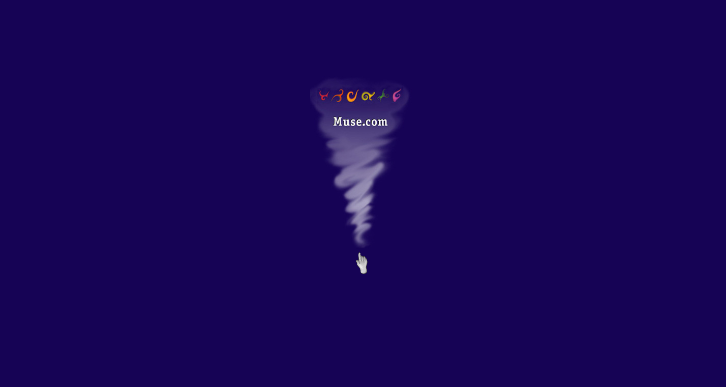
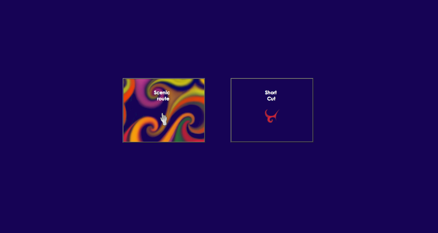
This first website is Muse. I am not sure what this website is about but this site was stumbled upon and it was so strange and different that I had to show you guys. Something I didn’t like about it was that you could only click on the hand to naviate and there was no real understanding of what was going on.
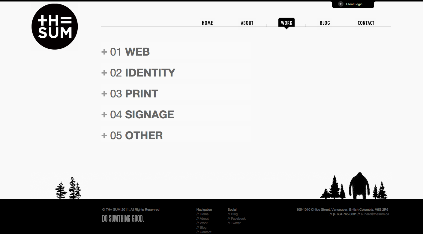
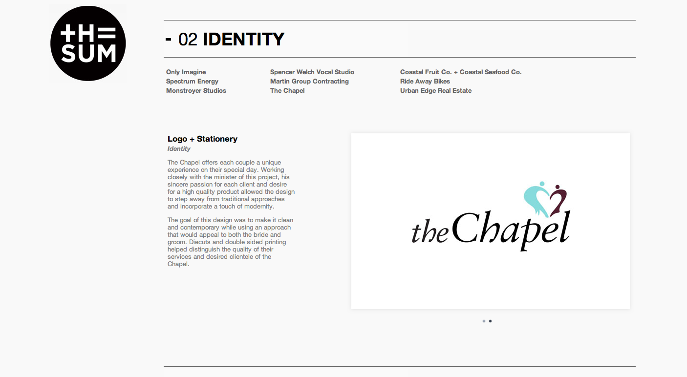
This second website The Sum was my favorite! This is an online portfolio and freelance company. I love the whole design and the navigation. It was so clean and clear. One thing I really liked that I have not seen before was their logo moved down the page as you scrolled down the page. It was always on the left side floating and never covered anything up. I thought it was really unique. I also liked that everything was black and white except their own work which was displayed in color.
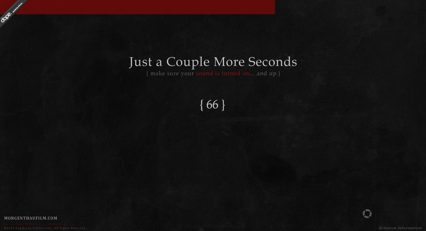

This last website Morgen Thau Film. It was a movie website featuring this interactive timeline of events that were in the movie. I also loved the loading screen. Since it was a flash website it took some time for the site to load. While it was loading, it was not your average loading bar, it was a sentance and had sayings that kept your interest. This site amazed me from the beginning.
James Muspratt
Feb 4, 2011
Stories within Stories
On Wednesday, Adam's treatment of Kafka's Metamorphosis brought up the idea of creating new stories within books through typography. This is the book project I mentioned in class. Jonathan Safran Foer (better-known as a novel-writer) collaborated with designer Sara de Bondt to create Tree of Codes, a new work made entirely from the book Street of Crocodiles.
James Muspratt
Feb 4, 2011
Reading for February 7
Here is the assignment for Monday, February 7:
- Read Zeldman, Ch. 10.
- Continue working on both parts of Project 1
- If you are in Group B, get your prose text to the point that you can present it and get feedback from the group. Think of questions you want to ask the group, whether they relate to design or code or both.
James Muspratt
Feb 6, 2011
Critique for Group B on Monday
Just a reminder, if you are in Group B, we will be reviewing your first project tomorrow night (Feb 7).
- Group B (updated)
- Adam Filer
- Don Mann
- Xavier Payne
- Rex Runyeon
- Courtney Spencer
- Jill Thompson
- Kelsey Ullrich
- Steve Womack
James Muspratt
Feb 7, 2011
The CSS Box Model
Here are tonight’s slides on the CSS Box Model.
James Muspratt
Feb 7, 2011
Reading for February 9
Hi all, please read the following for Thursday:
- BrainJar on CSS Positioning (just the first page)
- The CSS Box Model
Don Mann
Feb 8, 2011
Don's show and tell
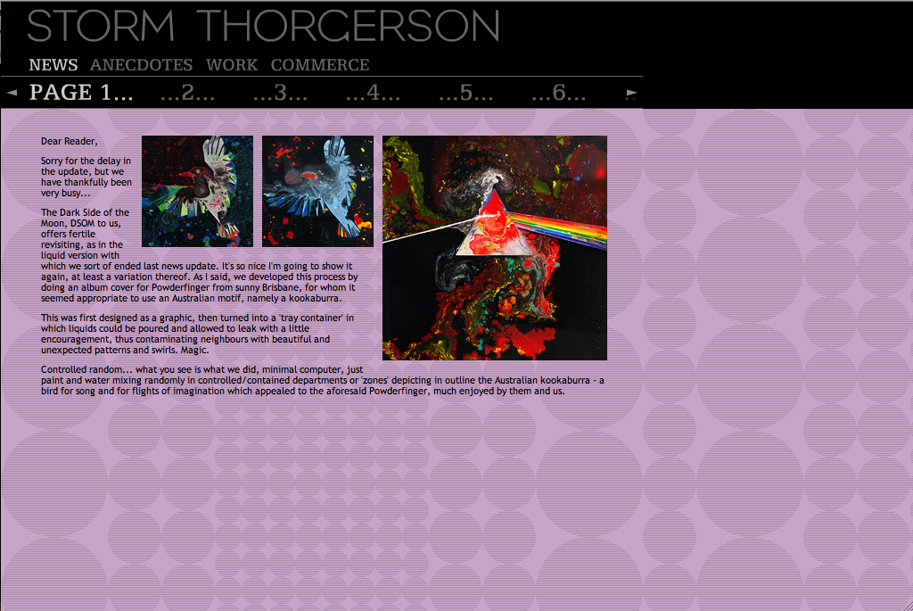
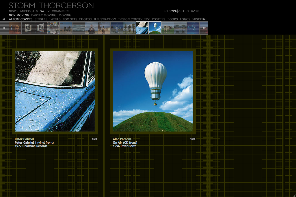
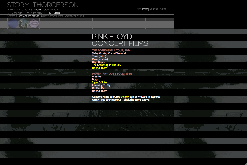
This website, I think is really good, I like how the designer of the website molded it to Storm Thorgerson style. Each of the tabs for different pages has radial movements if you place the mouse on them, I think that's impressive since I can't do that. To me, I think the website is somewhat simple to navigate and I think it's clever that each piece of work has an eye on the lower right side, if you click on it it tells you info on how the work was made.
James Muspratt
Feb 8, 2011
Show and Tell Full Schedule
Here is the schedule for show and tell for the rest of the semester:
| 1 19 | — |
| 1 24 | — |
| 1 26 | aaron |
| 1 31 | katelyn, don |
| 2 02 | xavier |
| 2 07 | rex, courtney |
| 2 09 | jill |
| 2 14 | adam a |
| 2 16 | eric |
| 2 21 | richard |
| 2 23 | mark |
| 2 28 | kelsey |
| 3 02 | steve |
| 3 07 | adam f |
| 3 09 | katelyn |
| 3 14 | (break) |
| 3 16 | (break) |
| 3 21 | (critiques) |
| 3 23 | (critique) |
| 3 28 | aaron |
| 3 30 | don |
| 4 4 | xavier, jill |
| 4 6 | rex, courtney |
| 4 11 | adam a, |
| 4 13 | eric, richard |
| 4 18 | mark2, kelsey |
| 4 20 | steve, adam f |
| 4 25 | (critique) |
| 4 27 | (critique) |
| 5 02 | — |
| 5 04 | — |
James Muspratt
Feb 9, 2011
Feb 9 class canceled
Hi everyone, class is canceled tonight due to weather. See you Monday!
James Muspratt
Feb 9, 2011
Project 1 Final Details
Hi everyone, here are some details about Project 1.
Submitting and Archiving
- Both parts of Project 1 are due on February 16, in class. I will pass around a flash drive and have you copy your files onto it. Please make sure you have your final files at the beginning of class: I recommend bringing them in on a drive and having backup copies in your email or on the server, just in case.
- Unless you have (reasonable) objections, I will be posting your projects to the website so the class can view and learn from them.
- To help with that process, please name your files as follows: Create two folders, one called lastname-project1a and the other lastname-project1b. Inside each, put files called index.html and style.css. Don’t forget to update the
<link>tag in your HTML to refer to the new name of the CSS file.
Criteria for Grading
Remember that this project is both about writing valid, semantic code and employing compelling, refined, or inventive typography. As you get closer to finalizing your projects, please take into account the critiques you heard from the class in the past two weeks: in some cases this is a matter of small tweaks to spacing or fonts, with others it’s a matter of making bigger choices about what your design is trying to accomplish.
In no particular order, here are the core questions I’ll be asking:
- Does the HTML and CSS validate? If not, is there a clear reason why not?
- Is the mark-up written to be semantic and structural, rather than presentational?
- Has basic care been taken to proofread the text for transcription errors, extra spaces, etc.?
- Have proper HTML entities been used for non-ASCII typographic characters like curly quotation marks, apostrophes, dashes, ellipses, fractions, etc.?
- If appropriate to the design, have typographic “finer points” been observed? Do the quotation marks hang, do drop-caps line up with their baseline, have small caps been used?
- Does the typography retain its legibility and character if the text is resized up or down a level?
- Does the typography — not just choice of typeface, but also the measure, leading, type sizes, arrangement, and color — convey a thoughtful idea about, or approach to, the particular text? In other words, do the whole set of typographic “moves” add up to a coherent design?
James Muspratt
Feb 13, 2011
Browser Tools for Web Developers
Here are links to the browser tools I’ve mentioned in a few classes:
- Safari has a dedicated Developer menu that you can turn on. Go to Safari > Preferences > Advanced and check “Show Develop menu in menu bar”. Now you can use the Develop menu to turn stylesheets off, show the Web Inspector, etc. You can also right-click a particular element on a web page and choose “Inspect This” to see that area of code and the styles that are being applied to it. (This “Web Inspector” is active by default in Chrome).
- The excellent Web Developer Toolbar does similar tricks and more, allowing you to outline elements, view a page’s CSS, etc. It’s available for Firefox and Chrome and gets installed as an extra toolbar — in Firefox it’s a big toolbar with icons, but with Chrome it’s a subtle Gear icon off to the right of your address bar.
Eric Andre
Feb 14, 2011
Site in development
Updated the link so it works now. There was a d instead of a 2 in the link code.
Just started a new website that I will be updating as the class progresses. It is extremely basic right now and only has my class projects. All comments and suggestions welcome. Just kind of a journal or sketchbook for the class.
32-Bit StudioJames Muspratt
Feb 14, 2011
Web 1 Exercise
Download the exercise here. We will upload your changes manually to the site.
Jill Thompson
Feb 14, 2011
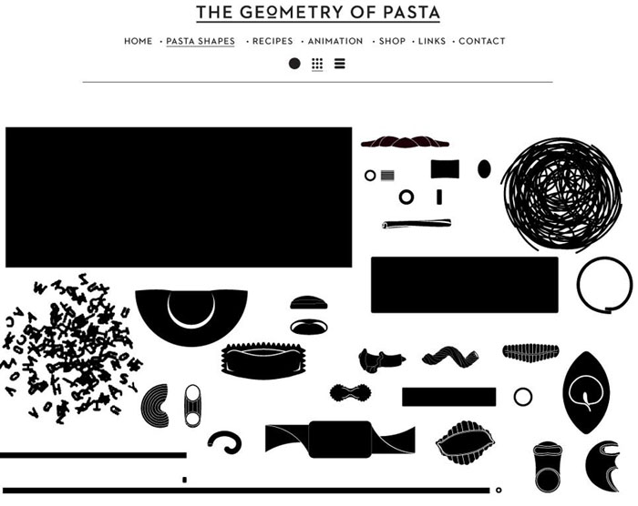
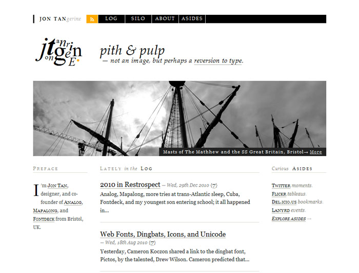
Web sites for Geometry of Pasta and Jon Tangerine
The first site I want to include on our class blog is for Geometry of Pasta.. I think this site works very well even though it is only black and white. There are 2 things I especially like:- The page that has all of the different types of pasta on it- Each piece is clickable and takes you to information about that pasta type.
- The logo- Although it is an image and not styled with CSS, it is still an example of how we can add a variety of type to our web sites even though the type choices on the web are somewhat limited now.
James Muspratt
Feb 16, 2011
Exercises 3, 4, 5 (Floats)
Download exercises 3, 4, and 5 to your machine for Wednesday, February 15.
James Muspratt
Feb 17, 2011
Reading for February 21
Please read the following for Monday:
- Containing Floats by Eric Meyer.
- Myths and Misconceptions about Grid Systems, by Antonio Carusone
- Zeldman, Ch. 9 and review Ch. 10 again.
James Muspratt
Feb 17, 2011
Dish Conference is Feb 25-26
Just wanted to remind you that the AIGA Dish Conference is February 25 and 26. There are some great speakers and a portfolio review. If you sign up by February 20th, it’s $35.
James Muspratt
Feb 17, 2011
Project 2
From the syllabus:
(Option 1) Infographic
Using HTML, CSS, and images, create a single- or multi- page infographic on a topic that invites a systematic visual explanation. Prototype your idea with sketches, then move to code early. Use scale, white space, and a grid to describe and orient the user to the material. Don’t rely entirely on images to carry the information. We will emphasize iterating your design based on class critiques.
(Option 2) CV
Create an online version of your résumé that is detailed but easy to scan and read. Pay attention to which typographic “moves” translate well from your print version and which need to be reconsidered for the web. Consider incorporating web-specific technologies: microformats (hcards), embedded Google maps, or other dynamic elements that give the reader a bigger picture of your work experience, education, skills, etc. Include intra-page navigation or use multiple pages if necessary.
Whichever project you choose, be prepared to discuss your choice of layout techniques. We will view and critique the project on a variety of browsers, OSs, and mobile devices.
Description
The point of Project 2 is for you (a) to practice using the web as a medium of information design, and (b) to wrestle with more advanced CSS layout techniques. Most likely you will want to incorporate a grid system, short bursts of explanatory text, and possibly icons, maps, photographs, or illustrations. As with Project 1, I think the best results will come from “doing a lot with a little” — that is, thinking through each design move so that they all count, rather than flooding the screen with a redundant or disorganized visual material.
If you go with the résumé/bio/about page, think about what makes your bio, work, skills, and interests unique. What are the common threads that you might be able to tease out and make prominent? If you’ve moved around the country or state, maybe you would want a map image to serve as the organizing principle of your site, and your experiences could be overlaid as boxes on top of the map. If you’ve worked while you’ve been in school, a timeline might be a good choice, since you could reveal relationships between the courses you were taking and the jobs you were working at any given point in time. Of course, it’s not critical that a single visual device orchestrate all of your information, but it’s good to have a hierarchy in mind, so that your audience can progress through your site in a logical way.
If you want to do the infographic, look for a subject, event, or data set that is meaningful to you or directly relates to your experience. I’ve found that a systematic and “objective” visualization of a topic about which the designer has a strong opinion often makes for the most compelling design work. If you feel you have promising source material (e.g all the books you read last year) but aren’t sure how to present it, try the LATCH acronym: how would the presentation differ if you organized your information by location, alphabetical order, time, category, or hierarchy? With the books example, each of those organizing principles could create radically different infographics.
With both projects, your primary concern should be finding a visual structure that tells your story best. When you brainstorm, sketch each of your ideas on paper and return to them frequently. What first seems like a silly idea may turn out to be great when combined with another one.
Inspiration for the Résumé/Bio/About Page Option
Inspiration for the Online Infographics Option
James Muspratt
Feb 20, 2011
Project 1 is Online
Nice work on Project 1 everybody!
I have put all your mini-sites in the new projects section of the site. Take a look and view source.
Eric Andre
Feb 21, 2011
Show and Tell - Andre
Here are the web site I showed during the last class.
by far my favorite was major output. I love how the only content on the page is pixel art made directly on the page and submitted by the visitors. When you see 8-bit pixel art you tend to think that it's really easy, but it's not. Especially with todays computers. It's actually very difficult to find programs, if any, that can do things this simple. Also, because of how limited pixel art is it forces you to be extremely creative within those limits.
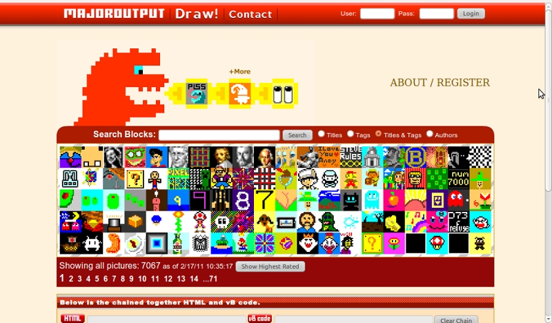
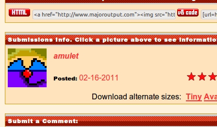
The image that I started before class was posted on their site.
This artist's site was interesting. I liked the art style and I think it went well with the design. The only thing that I didn't like was how it broke the seamless quality when you actually clicked on an image. Opening it into a new window.
I liked the simplicity of this design. Very clean/high contrast. It would have been nice if the boxes that opened went down when you clicked them again. Something that made it so you didn't have to scroll too much.
James Muspratt
Feb 21, 2011
Automated HTML with Textile
The tool I showed you tonight is called Textile. The idea is that it will take plain text and turn it into valid HTML, wrapping paragraphs with <p> tags and converting common ASCII characters (apostrophes, quotation marks, dashes, etc.) into their proper typographic HTML entities. You can also output certain HTML tags through special syntax. (*Some text* will output <strong>some text</strong>, for example. The best way to understand it is to try running different kinds of text through it and reading the “Phrase Modifiers” on the page.
James Muspratt
Feb 22, 2011
Various
- From now on, your show-and-tell posts (800px-wide images + your commentary) must be posted within a week of your in-class presentation. Sooner is better though!
- For Wednesday, please bring in refined sketches of your idea(s) for Project 2. You don’t have to have every detail worked out, but you should have picked the content/dataset and have specific proposals showing how you might present it on the web. Remember, the way you describe/sort/categorize/show the material is more important than how you end up styling it.
James Muspratt
Feb 22, 2011
More Infographic Inspiration
Some more sites to look at if you’re taking an infographic approach to Project 2:
- Good Magazine infographics
- Fathom, Ben Fry’s infographic-centric studio
- Leftloft, an Italian design studio.
- Pentagram: data visualizations
Richard Cook
Feb 22, 2011
20 things I learned
20 things I learned is a promotional web site from google. It has lot's of additional information about web design in a cute children's book format.

Richard Cook
Feb 22, 2011
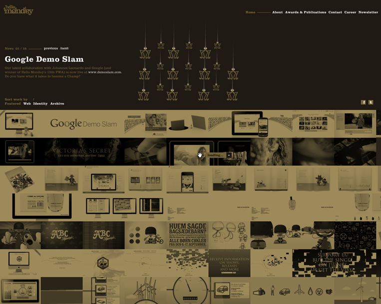
Hello Monday
A web site with lots of information. Very busy and interactive. This site is designed by international web and information design company
Richard Cook
Feb 22, 2011
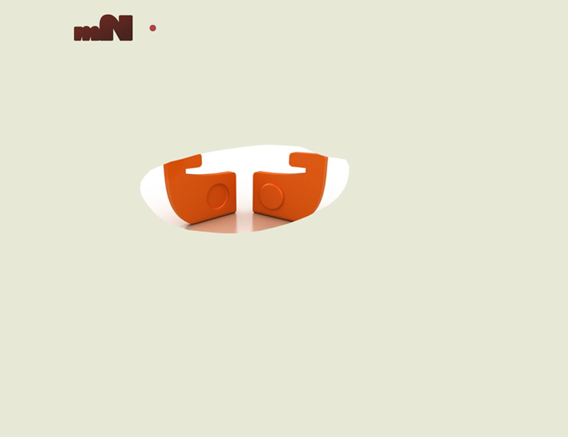
mn web site
A design company web site with a great little interactive opening page. Navigation is a little hard to find
Richard Cook
Feb 22, 2011
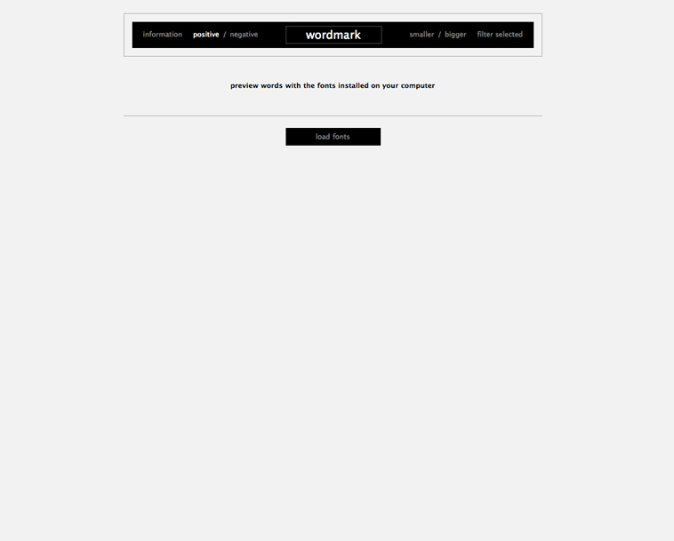
word mark web site
Word mark is a great type viewing web site. It shows all fonts on the users personal computer. A great working tool for designers.
Richard Cook
Feb 22, 2011
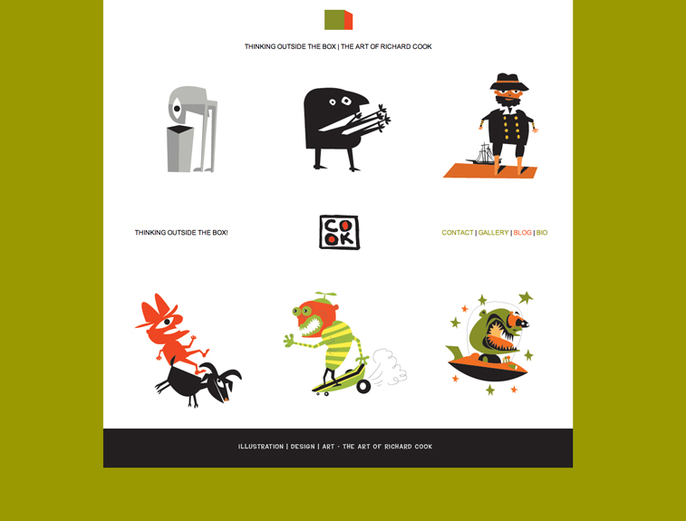
squarecook
My web site for illustration. I show only adobe illustrator pieces on this site. It was designed last year by me, before web class. I created it using Adobe Illustrator, Photoshop and Dreamweaver.
James Muspratt
Feb 23, 2011
Exercises 6, 7, 8 (CSS Positioning)
Please download the files to your machine.
James Muspratt
Feb 24, 2011
Assignment for Monday, Feb 28
Please do the following for Monday:
Review CSS floats and positioning
Floats and positioning are big topics, but it’s likely you’ll need one or both techniques for Project 2. The following articles cover these two topics in different ways and with different amounts of detail; I think those differences will actually help you get a handle on the material faster.
- Handcrafted CSS, Chapter 1. This book is required, but note that you can view Chapter 1 for free with Amazon’s Kindle preview.
- Maxdesign’s Float Tutorial (Especially Tutorials 4 and 8)
- Quirksmode Positioning Demo
- Brainjar on Floats and Positioning – read pages 3 through 5.
Bring in Wireframes for Project 2
By now you should have a fairly clear idea of how you will present the information — whether informational or biographical — in Project 2. The goal of wireframing is to start making decisions about the particular content, layout, and hierarchy of your page(s), without worrying too much about typography or color. Your wireframe can be sketched or drawn in Illustrator or Photoshop, and you can render blocks of text as a few horizontal lines and images as boxes with X’s through them.
You should use the looseness of the format to work out fundamental issues like the sequence, scale, and relationship of your elements. What will your site visitors look at first, and how will they know what they can click on and where they should start reading? Most likely your first few attempts will reveal potential problems in the layout or the hierarchy of the content — give yourself time to go back and try solving the problem in different ways.
I haven’t found very many good articles on wireframing. Instead I’d recommend just browsing this Flickr gallery, Adaptive Path’s sketchboards, Web Design Ledgher’s gallery, and the Wireframes for the Wicked presentation to get an idea of the variety of methods and levels of details that designers use.
Good luck!
James Muspratt
Feb 24, 2011
Posting images
For those who haven’t posted images to the site yet, here’s a quick run-down on how to do so.

- Take screenshots and crop them to 800 px wide
- Log in to Textpattern and click on the images tab
- Use the Multiple Image uploader to select all your images
- Click upload (otherwise the progress bars will just sit there)
- For each image, click the “XHTML” link to the right of the thumbnail.
- In the pop-up, click Build Tag and copy the HTML that appears in the text area below
- Close the pop-up window and click on the Write tab in Textpattern,
- Paste the HTML for that image into the body of the post you’re writing
- Be sure your
<img />tag has an alt attribute that describes it in brief, and be sure to wrap it in<p>tags. Finally, since the site uses a responsive design that allows images to scale, remove any height and width attributes completely. The final result should look something like:
<p><img src="http://web1.jamesmuspratt.com/images/1.jpg" alt="My cat on my desk" /></p>
Adam Agee
Feb 28, 2011
Nawlz site again
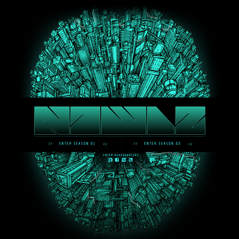 WOW, I finally got it right.
As I stated before, I chose this site for the way the type interacts with the images through out the site. Also the different font choices.
Here are a few more images from the site that shows the images through the text. This happens when you hover over the season selections in the main menu of the comic.
WOW, I finally got it right.
As I stated before, I chose this site for the way the type interacts with the images through out the site. Also the different font choices.
Here are a few more images from the site that shows the images through the text. This happens when you hover over the season selections in the main menu of the comic.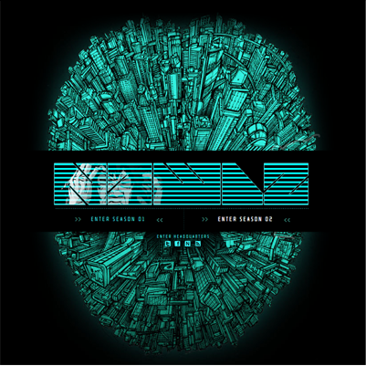
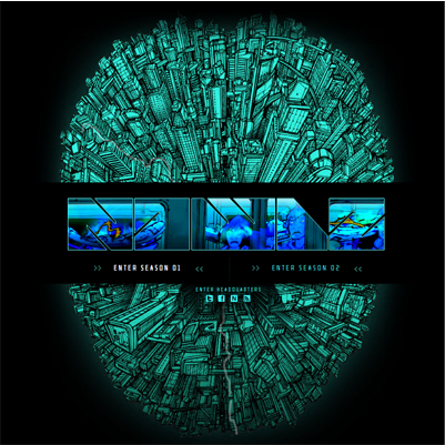
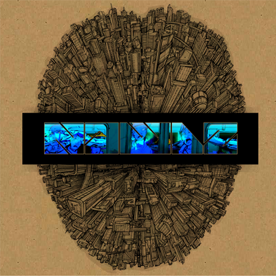
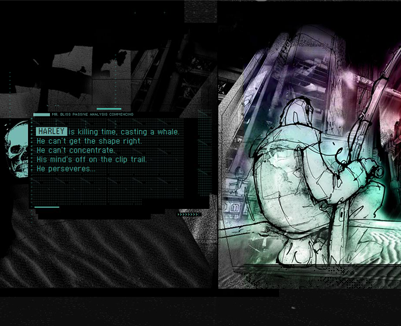
These last two are secondary screens inside the two different chapters.
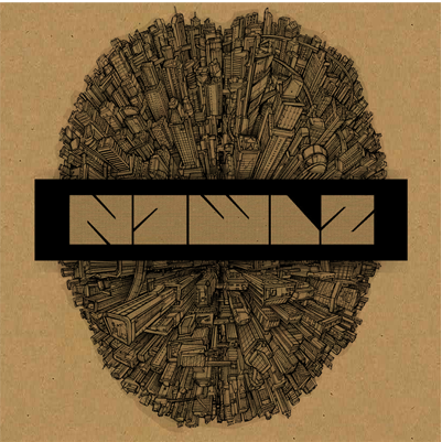
And now here are some screen shots that show some of the different fonts used in the design of the site.

James Muspratt
Feb 28, 2011
Exercises 9, 10, 11 (Background Images)
Please download the exercise files to your machine.
Xavier Payne
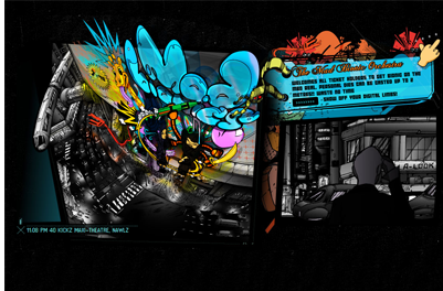
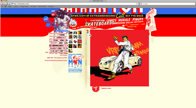
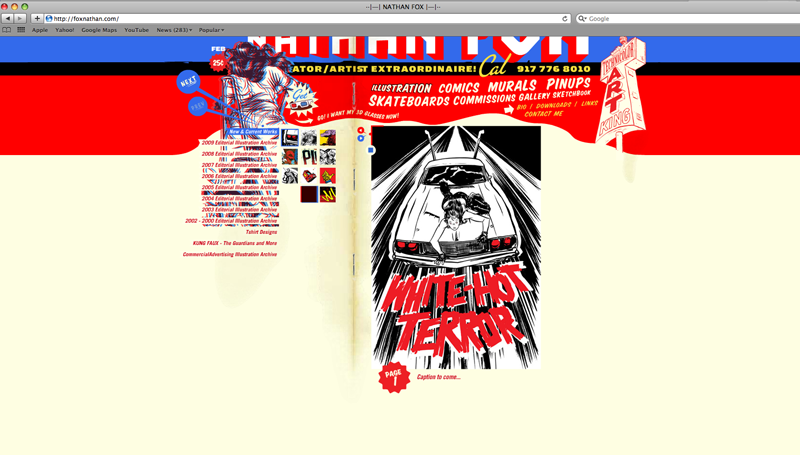
Mar 2, 2011
Xavier Show and Tell
This was a site from a very talented illustrator named Nathan Fox. His site has a lot of little touches that help reflect his illustrative style. The site has a very comic and graphic look to it.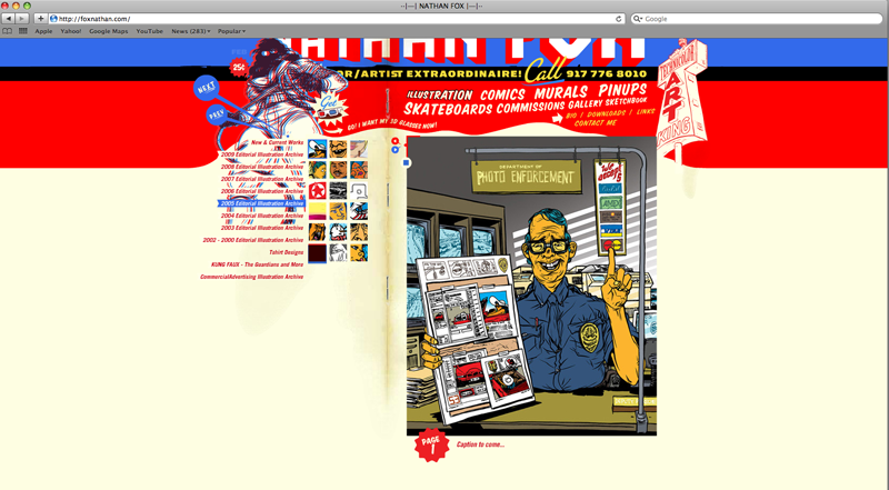
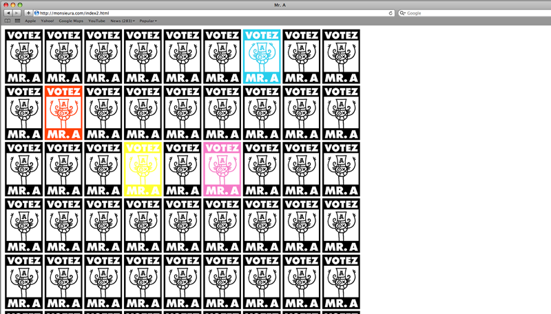
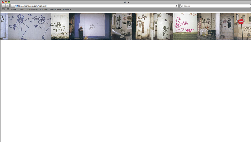
 This is a site from a graffiti artist named Mr. A. He has a very simple site, but the political campaign concept is very strong.
James Muspratt
Mar 6, 2011
Scheduling Updates
Project 2 Schedule
I am moving the final due date for Project 2 to April 4. As with Project 1, you are responsible for bringing your final files into class on the due date — late submissions will not be accepted. We will be doing mid-project critiques the week after our break: Group B will present their work on March 21, while Group A will present on Mar 23. If you are behind with your design and/or code, please use March break to catch up.
Updated Groups
- Group A
- Adam Agee
- Eric Andre
- Richard Cook
- Mark Fentriss
- Aaron Johnson
- Katelyn Joughin
- Group B
- Don Mann
- Xavier Payne
- Rex Runyeon
- Courtney Spencer
- Jill Thompson
- Kelsey Ullrich
- Steve Womack
Finally, here is the updated schedule for Show and Tell through the end of the semester.
Show and Tell Schedule
| 3 09 | katelyn |
| 3 14 | (break) |
| 3 16 | (break) |
| 3 21 | (critiques) |
| 3 23 | (critique) |
| 3 28 | aaron |
| 3 30 | don |
| 4 4 | xavier, jill |
| 4 6 | rex, courtney |
| 4 11 | adam a |
| 4 13 | eric, richard |
| 4 18 | mark, kelsey |
| 4 20 | steve, adam f |
| 4 25 | (critique) |
| 4 27 | (critique) |
| 5 02 | — |
| 5 04 | — |
Richard Cook
Mar 7, 2011
Overall web design article
This article has some great information about overall web design and meta tags, with some informational links.
Mark Fentriss
Mar 7, 2011
Team Green Fundraising
The view of this site does not appear to change when clicking a button on a laptop screen because all the content is lower. It does view fully on a larger desktop screen.

Mark Fentriss
Mar 7, 2011
Heart 2 Heart
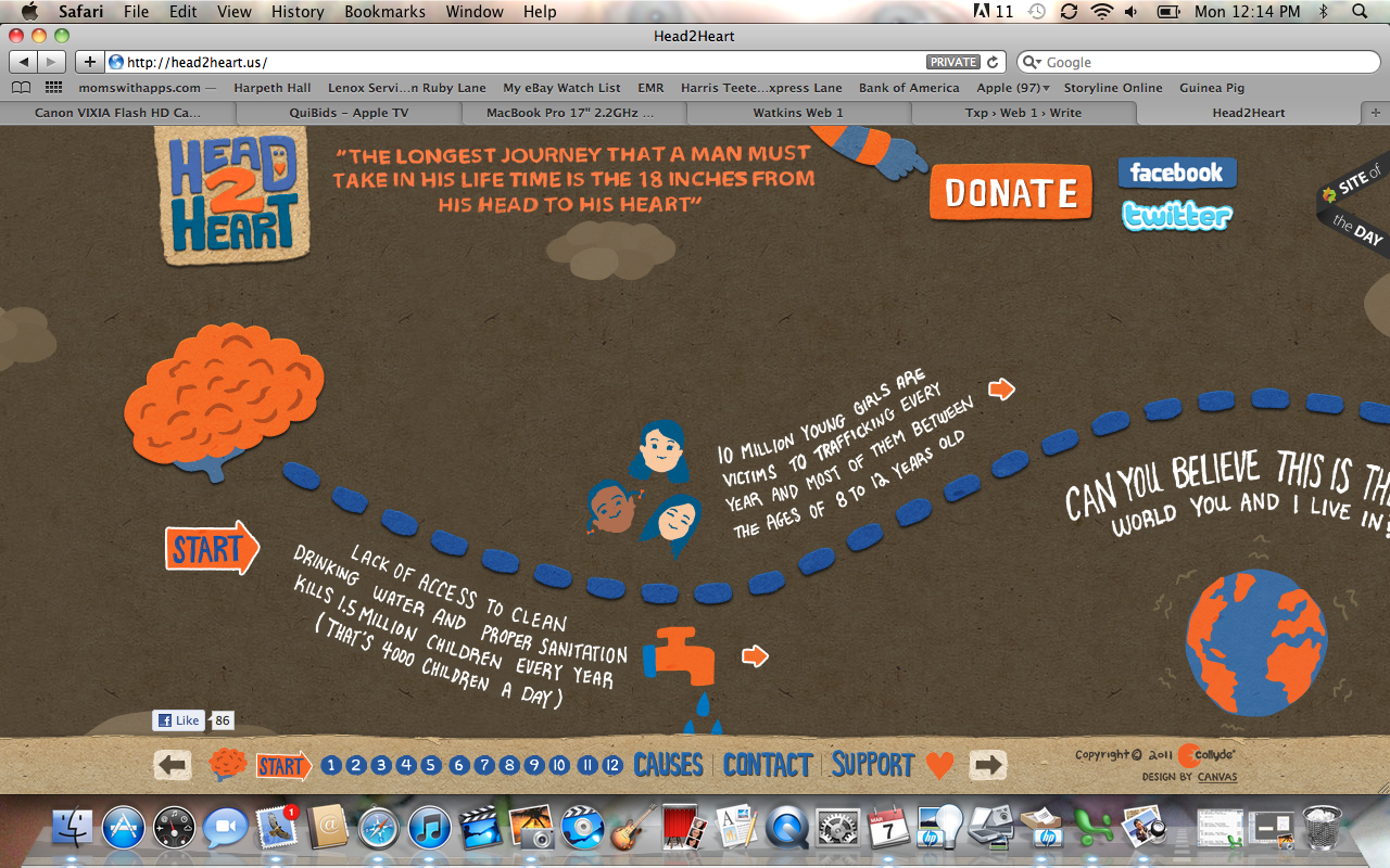
A fundraising site recruiting money and designers. It moves horizontally and requires some interaction. The arrows could be larger to click.
Mark Fentriss
Mar 7, 2011
Erin Kendig - Populations
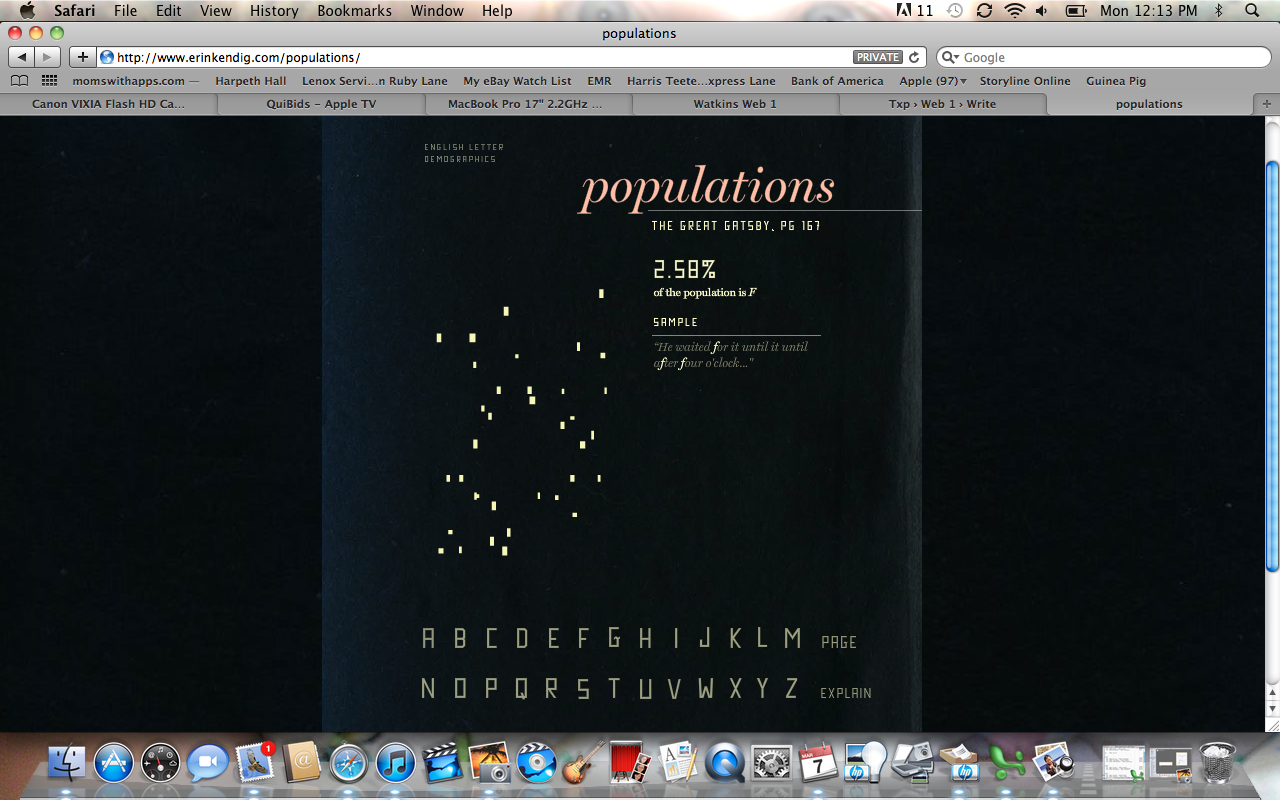
She uses an info graphic to show the populations of letters from one page of the Great Gatsby.
Mark Fentriss
Mar 7, 2011
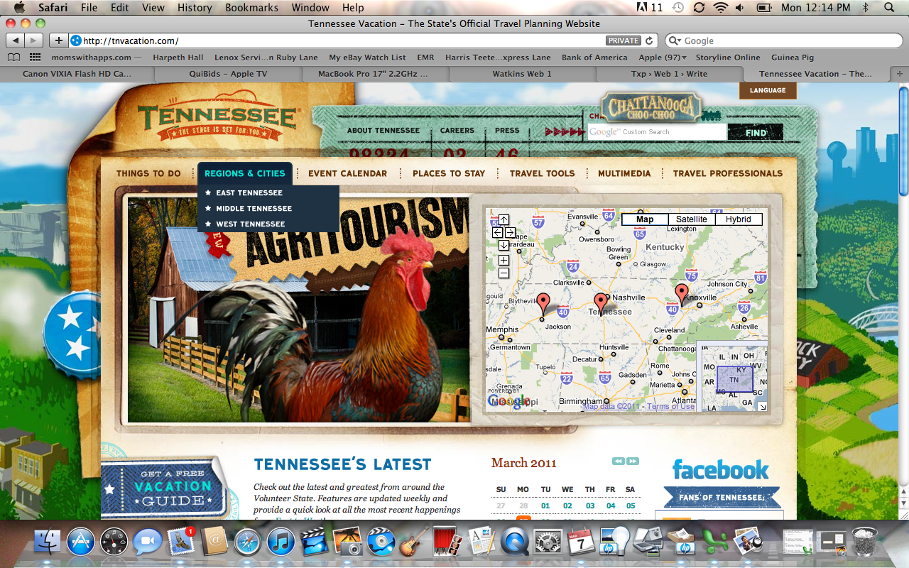
Tennessee Vacation
This is a tourism site for Tennessee. Very busy. If you search for a place to stay by zip code, you may not find a close address quickly. Places are listed alphabetically in the state.
Mark Fentriss
Mar 7, 2011
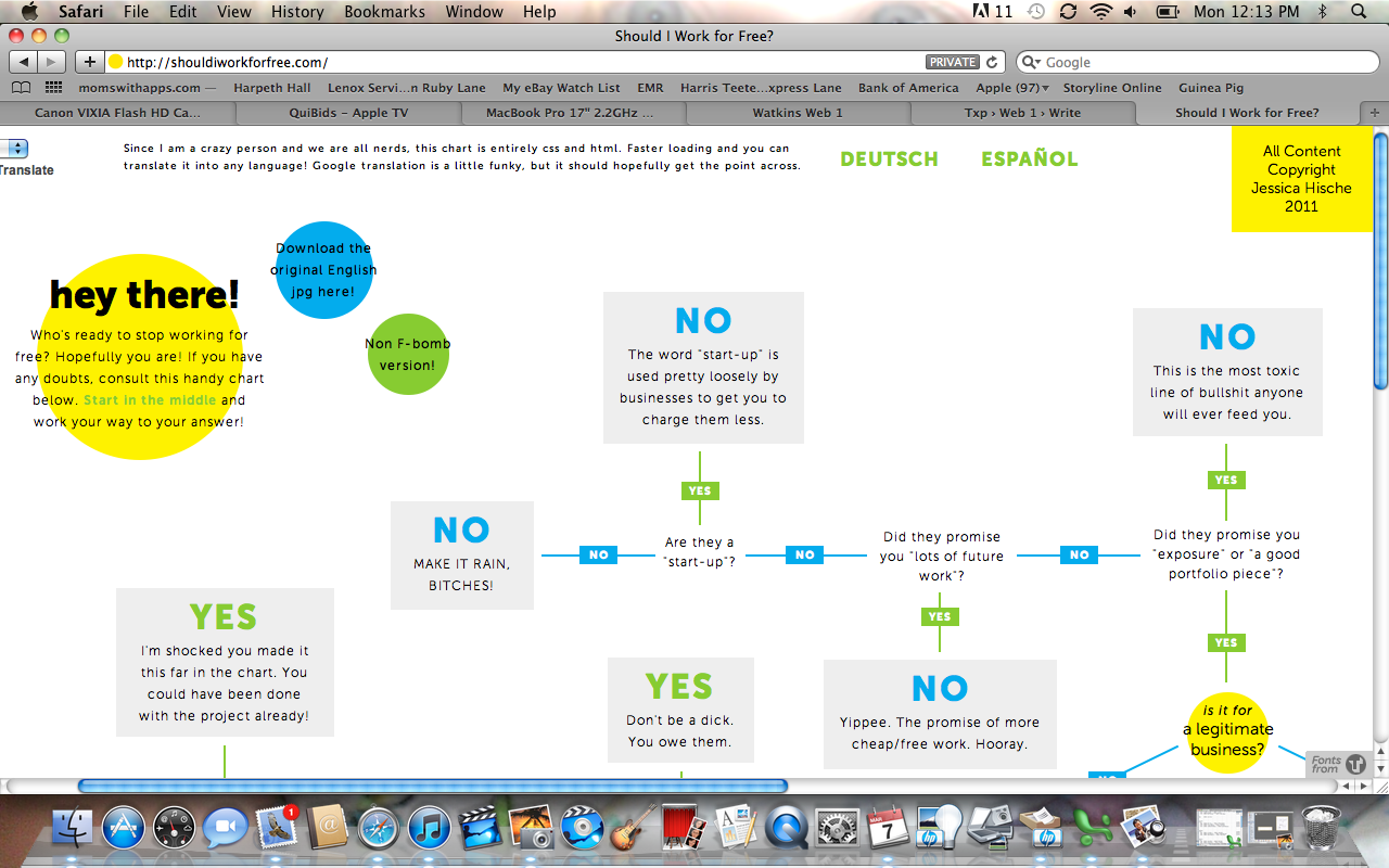
Should I Work For Free
This site is written only in CSS and HTML. You may move the page around easily. Very few links. It translates relatively the same into other languages.
Mark Fentriss
Mar 7, 2011
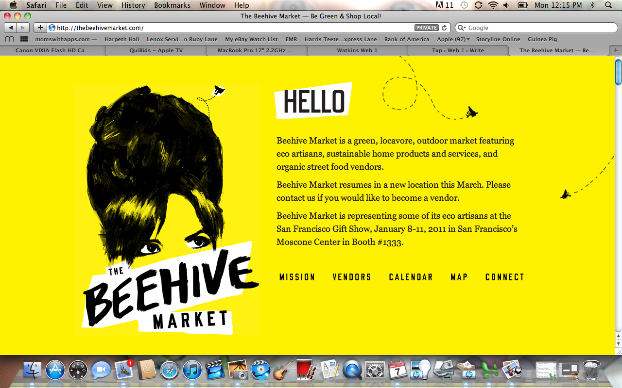
The Beehive Market
This site is for a farmers market in the Bay area. The links could have their own page address to make it easier to share info. If you wanted to send the directions, they would not have to scroll.
Kelsey Ullrich
Mar 7, 2011
kelsey show & tell
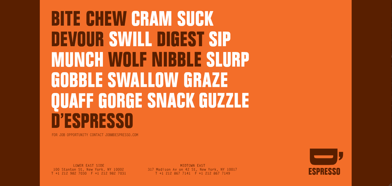
I really liked the minimialistic style of this site. It advertises a coffee shop in NYC. I feel it's very basic, yet memorable. It gives you the information up front and is very brief. I think that is something very benefical to websites when its very basic versus being too busy and overwhelming.
Kelsey Ullrich
Mar 7, 2011
kelsey show & tell
Again, this site is very simple as well. I really liked how the format was meant to be used only horizontally. The browser only allows you to scroll in one direction.
James Muspratt
Mar 9, 2011
Two articles on Floats and Positioning
Please read the following over break in addition to working on your projects:
- CSS Positioning 101, by Noah Stokes
- CSS Floats 101, by Noah Stokes
Katelyn Joughin
Mar 9, 2011
Show and Tell
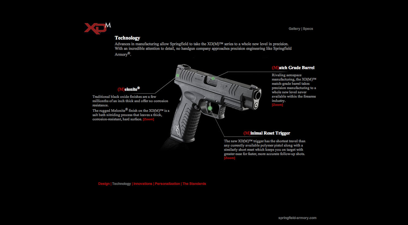
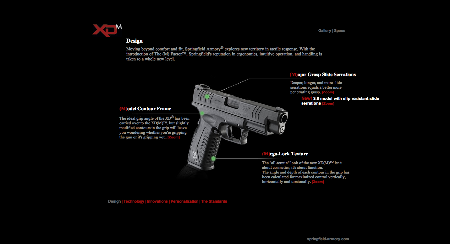
This first website is The-M-Factor. It is great for this project because it used a method where the diagram of the guns have a background image with the lines on it and then the text is positioned around the photo. It was a great technique and something that I think I can achieve.
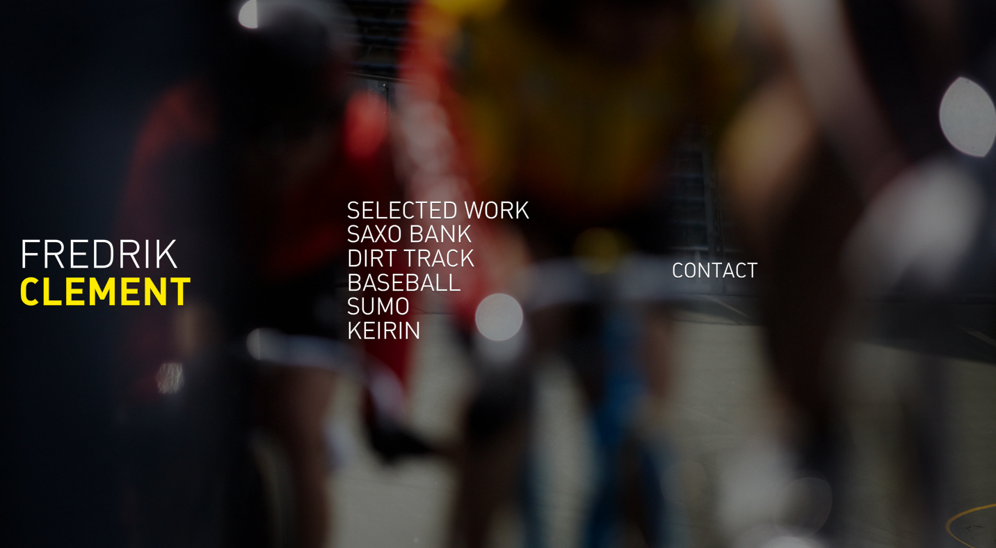
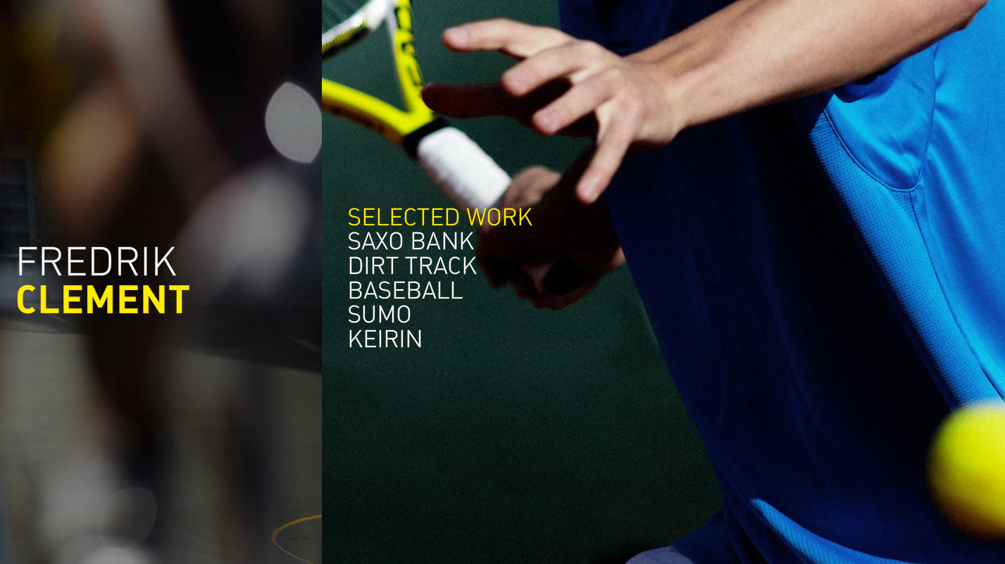
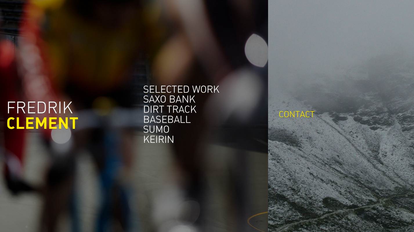
This second website Fredrik Clement. I thought this was a very interesting website because it not only scrolls up and down but side to side. This is the portfolio of a photographer and you can tell that the main focus is his images. I think it works really well for his purpose.
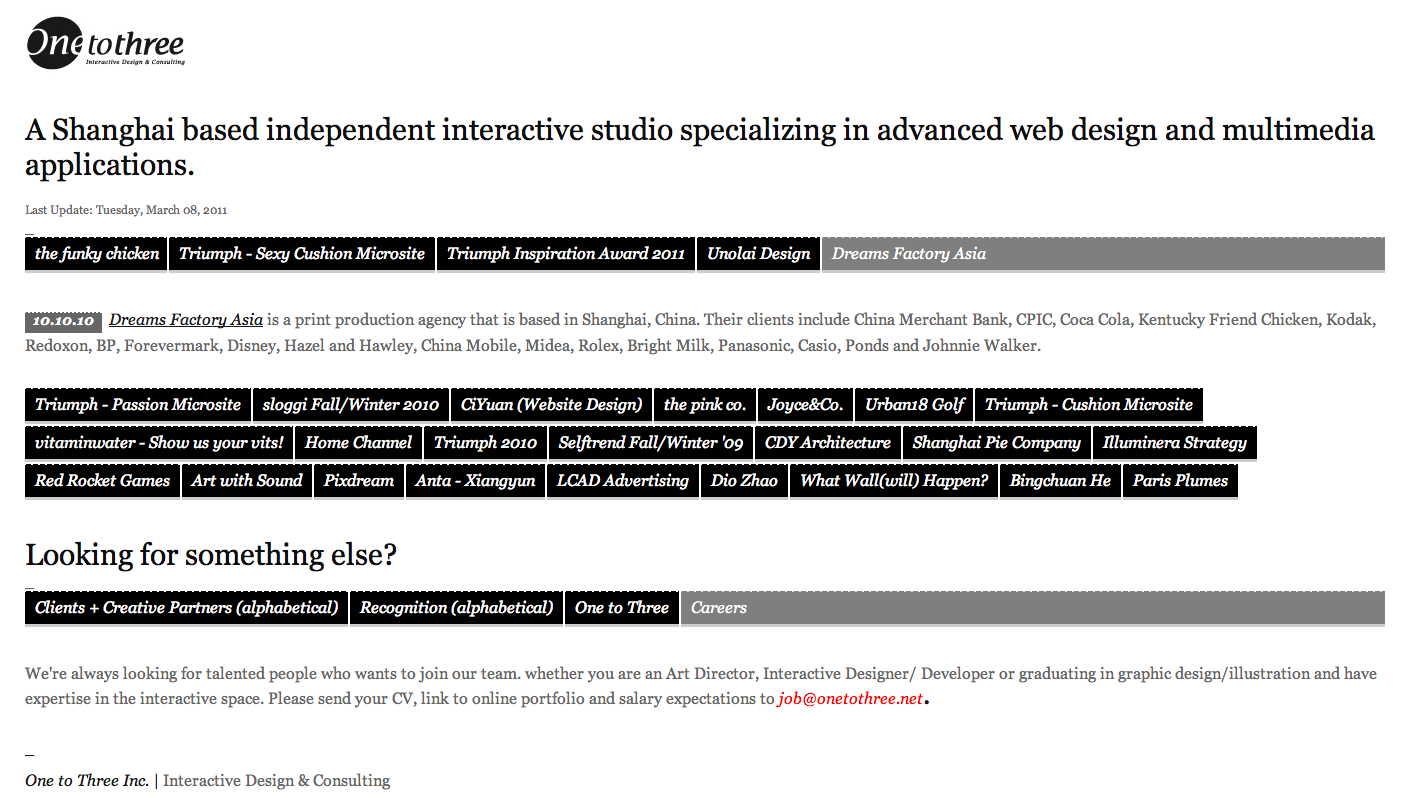
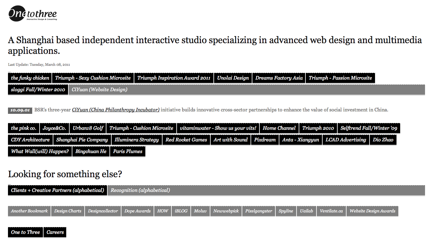
This last website onetothree. It is a Chinese's developing company. This page delivers access to their work through this block wall style that descends after a highlighted part is selected. I have never seen this before and it thought it was something different to share with the class.
James Muspratt
Mar 13, 2011
April Mueller
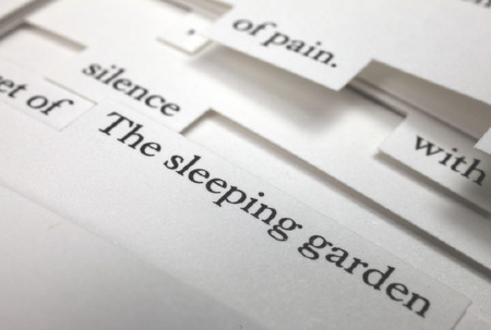
If you’re still refining the idea behind your Project 2, take a look at April Mueller’s about page. This is an image, not a web page, but it shows a nice, visual approach to a page that combines a résumé and funny biography.

James Muspratt
Mar 30, 2011
Exercises 12, 13, 14 (Review)
These three exercises touch on floats, positioning, background images, and descendent selectors. Download the files and get started.
James Muspratt
Mar 30, 2011
Dropbox
 If you haven’t tried it, take a look at Dropbox. Installing the software adds a special folder to your Mac or PC: put your files in it and it works like a regular folder, except it also backs them up to the web. So that means you can retrieve those files with just a web browser from another computer. It does other backup, syncing, and mobile tricks, but that’s the main idea. The free account gets you 2 GB.
Aaron Johnson
Mar 30, 2011
Show and Tell
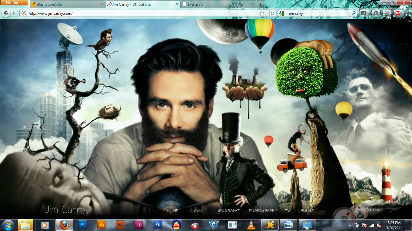
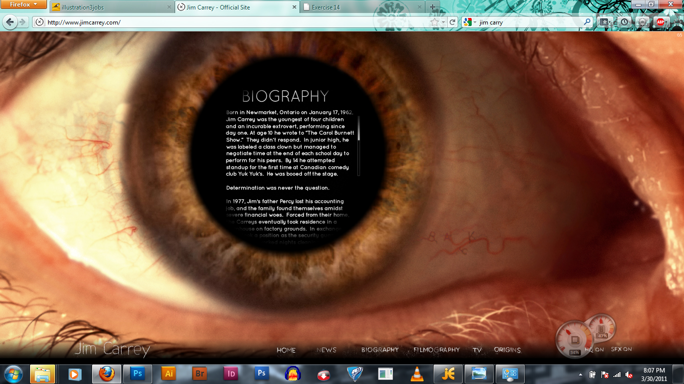
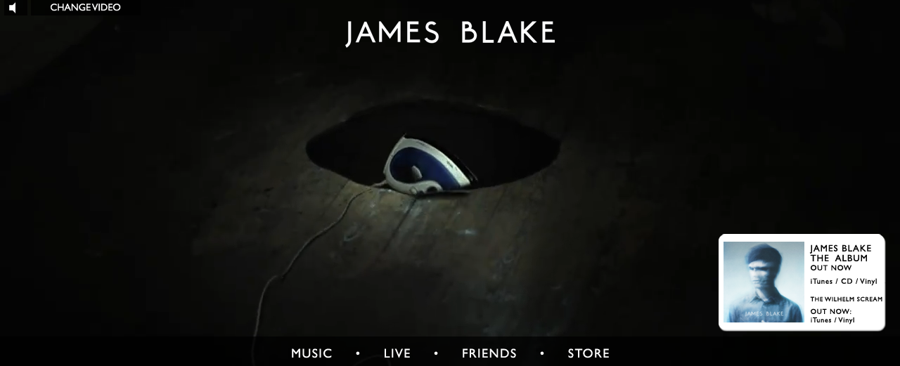
Here is a site I found to be creative. It acts as a kind of resume for Jim Carrey, yet it chooses to show his experience rather than list it. Items on the page can be clicked and will animate with sound from different movies he played in. Also clicking the bird twitter.
James Muspratt
Mar 31, 2011
Project 2 Final Details
Submitting and Archiving
- Project 2 is due in class on Monday, April 4.
- As with Project 1, please be ready to copy your files onto my flash drive. Name your files index.html and style.css and make sure they are working together. If you have a multi-page site, just make sure the home page is called index.html. Then put your files in a folder called lastname-project2.
Criteria for Grading
As we’ve discussed, Project 2 requires that you wrangle text and/or images in order to communicate information in a systematic way, preferably one that takes advantage of the natural properties of web pages: scrolling, linking, hovers, etc. Whether you are doing a straightforward résumé, an infographic, a mini-biography, or some hybrid of all of those things, please keep the following in mind:
- The fundamentals of typography and communication design in general still matter! Please check your spelling and grammar, use HTML entities for apostrophes, dashes, etc., and be deliberate about your typographic and layout choices. Use Textile if you’d like.
- Unless you have a good reason not to, use valid XHTML and CSS.
- Finally, do your best to write your final XHTML and CSS efficiently — where possible, use techniques that we’ve reviewed in class, like opposing floats, to create a robust grid design, or descendent selectors, to reduce the amount of redundancy in your stylesheet.
I’m looking forward to seeing the final version of your work. Good luck!
James Muspratt
Apr 3, 2011
Part 1: HTML Fundamentals
Tags and Attributes
The point of HTML markup is to communicate the structure or semantics of the content on your page through headings, paragraphs, lists, hypertext links, etc. While we may have to bend this rule every so often, HTML should not be used to effect a particular visual presentation: that’s the job of CSS.
Most tags are paired (<p>some content</p>), but a few are “self-closing,” like the break tag (<br />) and the image tag (<img src="photo.jpg" />). Any tag can have an attribute, which might be essential to its working at all (the src attribute in <img src="photo.jpg" />), or might only be useful in conjunction with CSS (the id attribute in <p id="footer">some content</p>). Note that this syntax is consistent across all tags: <tag attribute="value" otherattribute="othervalue">some content</tag>.
Typography
Straight HTML text is limited to the ASCII character set. Therefore you should use typographic entities to create “smart” quotes, en and em dashes, ampersands, fractions, etc. You can speed up this process by running your text through a markup generator like Textile or Markdown. Other typographic tricks include using a non-breaking space before the last word in a paragraph (this will prevent that word from ending up alone on the last line) and adding a <span class="caps"> around acronyms (you can then globally letter-space and reduce the font-size of span.caps with CSS).
James Muspratt
Apr 3, 2011
Part 2: CSS Fundamentals
CSS rules always follow the format below (watch your colons and semicolons). Note that multi-word properties are always hyphenated, while multiple values are separated by spaces (e.g. margin:0 10px;).
selector	{
	property: value;
	some-other-property: value1 value2;
	}
At the top of your stylesheet, you’ll want to use a CSS Reset. There are various versions, but a simple one is this:
body * {margin:0; padding:0; border:none;text-indent:0;text-decoration: none;outline:none;}
Margins
Margins push the object away from other objects. Like other CSS measurements, you can specify the margin amount in pixels (px), points (pt), percentages (%), or ems (em). Note that margins can also take the auto value: the most common use is to horizontally center a fixed-width content div by writing div#content {margin:0 auto;}
Be sure to take advantage of the “shorthand” versions of CSS declarations to avoid repetitive typing. The following three rules are equivalent:
p 	{
	margin-top:5px;
	margin-right:10px;
	margin-bottom:5px;
	margin-left:10px;
	}
p	{margin:5px 10px 5px 10px;}
p	{margin:5px 10px;}
Padding
Padding creates space inside the element, extending its background color and its borders (if any). There is no auto value for padding. Padding is useful for creating breathing room around an element, especially if it has backgrounds or borders applied.
Borders
Rules for borders follow similar patterns, and you can specify values for color, width, and style (solid, dotted, or dashed). The following two rules are equivalent:
p	{
	border-width: 2px;
	border-style:dotted;
	border-color:red;
	}
p {border: 2px dotted red;}
James Muspratt
Apr 3, 2011
Part 3: The Box Model
Every HTML tag can be understood as a box with a particular height, width, margins, and padding. The CSS “box model” is how we control the size and arrangement of HTML elements on the page.

Remember that things like padding, margins, and borders are added to any width or height you’ve specified, making the total width or height larger. A div set to width:420px; will not fit in a 420 pixel space if it also has positive margin, padding, or borders assigned to it.
The total space occupied by an element follows these rules:
total width = width + padding-left + padding-right + margin-right + margin-left + border-left + border-right
total height = height + padding-top + padding-bottom + margin-top + margin-bottom + border-top + border-bottom
James Muspratt
Apr 3, 2011
Part 4: Classes, IDs, Selectors
Classes vs. IDs
Classes and attributes should first be understood as attributes that you add to HTML entities – they just happen to be particularly useful as targets of CSS selectors. So you might change <p>Some content</p> to <p id="footer">Some content</p> so that you can style it a particular way.
The point of IDs is that they are unique identifiers for a particular HTML entity. Therefore, they only be used once on a page. If you want to create a set of things to be styled the same way, use a class: you could have <p class="infobox">Welcome to my site</p> near the top of the page and then <p class="infobox">Check out my other website...</p> further down the page.
CSS Selectors
Pay careful attention to the use of spaces: they indicate a descendent selector. p#special refers to the HTML element <p id="special">, but p #footer (with a space after the p) refers to “anything with an id of special inside a paragraph.” For example, the span inside <p>Some content <span id="special">some nested content<span></p>
This table summarizes the most common ways to style elements using IDs, classes, and descendent selectors:
| What we want to style | HTML | CSS Rule |
|---|---|---|
| All paragraphs | <p>Sample</p> |
p {color:red;} |
| All paragraphs with a class of special | <p class="special">Sample</p> |
p.special {color:red;} |
| The (only) paragraph with an id of first | <p id="first">Sample</p> |
p#first {color:red;} |
| Anything with a class of warning | <p class="warning">Sample</p>, but also <ul class="warning">, <div class="warning">, etc., if they exist. |
.warning {color:red;} |
| Paragraphs nested inside the maincontent div | <div id="maincontent"><p>Sample</p></div> |
div#maincontent p {color:red;} |
| List items nested inside unordered lists that have a class of ingredients | <ul class="ingredients"><li>Sample</li></ul> |
ul.ingredients li {color:red;} |
James Muspratt
Apr 3, 2011
Part 5: Advanced Selectors
Writing efficient CSS means being smart about your selectors. Here are some of the most useful techniques.
Select a series of HTML elements using comma-separated selectors
/* Make the headers, lists, and paragraphs
the same font size */
h1, h2, h3, p, ul, ol {
	font-size: 10px;
	}
Use descendent selectors to apply different styling to elements based on their container
For example, let’s remove bullets from our navigation list but make them circles on our content’s bulleted lists.
/* Select unordered lists inside the NAVIGATION div */
div#nav ul {list-style:none;}
/* Select unordered lists inside the MAIN div */
div#main ul {list-style-type:circle;}
Create a “current” class to highlight a particular navigation item on a page
/* Make the current navigation item black
instead of the default blue */
#nav li.current a {color:black;}
Just make sure to move the class to the corresponding list item on each page. The home page should look contain code that looks like this:
<ul id="nav">
	<li class="current"><a href="home.html">Home</a></li>
	<li><a href="about.html">About</a></li>
	<li><a href="contact.html">Contact</a></li>
</ul>
while the about page should look like this:
<ul id="nav">
	<li><a href="home.html">Home</a></li>
	<li class="current"><a href="about.html">About</a></li>
	<li><a href="contact.html">Contact</a></li>
</ul>
Highlight the current navigation item without changing your HTML
You can even achieve this same effect without the special class: instead, apply a page-identifying id to your body tag, give each navigation item its own id, and then use descendent selectors to apply the style selectively. Your HTML would look something like:
<!-- Navigation -->
<body id="home">
...
<ul>
	<li id="nav-home"><a href="#">Home</a></li>
	<li id="nav-about"><a href="#">About</a></li>
	<li id="nav-port"><a href="#">Portfolio</a></li>
</ul>
and it would work in conjunction with this CSS:
/* Make the current navigation item black by checking
the id on the body tag; then apply the rule only
to the corresponding navigation item */
body#home li#nav-home a,
body#about li#nav-about a,
body#port li#nav-port a
 {color:black;}
The main advantage of this technique is that you can copy and paste your navigation code between pages without changing anything. The disadvantage is that you must anticipate all the navigation possibilities in advance — if you go back and add a new navigation item to the HTML, you have to update the rule in your CSS too.
James Muspratt
Apr 3, 2011
Part 6: Backgrounds
Backgrounds have many uses in CSS, from tinting the background color of a div to replacing normal HTML text with pre-designed graphics via background-image. Like the color property, the background-color property can take colors as words (red, yellow), hexadecimal codes (#ccc, #ffed8b), rgb values (rgb(128,0,128)), or rgba values ( rgba(128,0,128, 0.5)). With rgba, you specify an alpha value (transparency). This will only be recognized by modern browsers; see this 24 ways article for more details. If you’re only specifying a color, use the background-color property:
div#main {background-color:yellow;}
If you’re using background images, you have a lot more properties and values to specify. It’s generally easiest to use the shorthand background property, as long as you get the order of the values correct. The following two rules are equivalent:
div#main {
	background-color: transparent;
	background-attachment: scroll; /* 'fixed' is the other option */
	background-repeat: no-repeat;
	background-image: url(bg.png);
	background-position: 5px 10px;
	}
div#main {background: transparent url(bg.png) no-repeat 5px 10px;}
Background images get cropped according to the calculated size of the HTML element to which they’ve been applied: in other words, a large image does not force its corresponding HTML element to expand. If you need your element to be bigger to show the whole background image, just force it to expand by setting an explicit width and height on your element:
p#infobox	{
	background: transparent url(huge-info-icon.png) no-repeat 10px 10px;
	width:200px;
	height:500px;
	}
James Muspratt
Apr 3, 2011
Project 3
Here’s Option 1 from from the syllabus:
Create a small web site (one to five pages) that showcases the development of a recent art/design/film project, preferably your own. Walk the visitor through sketches, the process of creating the work, inspirational sources, and commentary. Prioritize creating interesting and relevant site and page structures, rather than applying heavy styling. Balance the consistency and variety of the pages so that the site has a distinct identity without feeling monotonous.
What can you do to create multiply pathways through the material, instead of forcing your audience into a linear slideshow? Take advantage of the medium and attempt to tell your story in ways that would not be possible in print. If you can, incorporate light programming to add modularity, dynamic elements, or user contributions to your site.
Note: I should emphasize that the work you exhibit does not have to be your own. If you want to create a site all about an architectural project, a piece of music, a renaissance painting, or your favorite comic book, go for it. What matters most is that (a) you have access to (or can quickly create) visual material that shows the process by which the work came into being, and (b) you know enough about the work that you can convincingly guide your audience through the material.
I’m also adding Option 2:
If you have started a personal website with Project 2, go ahead and complete it for Project 3. The site should include your résumé and or bio (refined, if necessary) and serve as a portfolio for your art or design work. While a clear structure and logical navigation are important, you should also strive to create a site that reflects your own design or art sensibilities. In other words, don’t make something so generic it could just as easily be applied to another artist. Additional sections are encouraged: essays, links to other sites, etc.
James Muspratt
Apr 4, 2011
James Muspratt
Apr 5, 2011
WhatFont

As you browse websites, you may want to know what fonts are being used without going to the trouble of viewing the site’s entire CSS file. So take a look at WhatFont.
First, drag the bookmarklet to your bookmarks bar. Then, when you’re on any website, click the bookmarklet and hover over any text on the page.
Don Mann
Apr 6, 2011
Don Mann
With all three of the websites I posted, I thought these were the best in my opinion. I don't want to talk too much about it because I think the sites speak for themselves. They're great. Better than sliced wheat/white bread.
James Muspratt
Apr 6, 2011
Exercise 16 (jQuery)
Please download Exercise 16 to your machines. Good luck!
James Muspratt
Apr 10, 2011
Show and Tell - Final Schedule
Here’s the schedule: after these, everyone should have shown and told twice. Remember, your posts (screenshots, commentary) are due a week from the date of your showing and telling. Thanks.
| 4/11 | adam, courtney |
| 4/13 | eric, richard |
| 4/18 | mark, kelsey |
| 4/20 | steve |
| 4/25 | (critique) |
| 4/27 | (critique) |
| 5/02 | — |
| 5/04 | — |
Jill Thompson
Apr 10, 2011
Web sites for Okapi and StuffandNonsense
The first web site I selected is from Stuff And Nonsense Web site Design Studio. I selected it because it talked about and reflected a lot of things we have been studying in class about making web sites attractive and readable across multiple browsers.
There are also specific details about the site that I like:
- On the Work page, I like that although the projects are stacked on top of each other, pieces of the images overlap with other projects. I feel that this keeps the layout from being too sterile.
- Their Blog has a lightly different layout from other blogs. The column widths are mixed up a little, so that the widest column is not in the middle.
- They have injected some additional humor into the site by making the Help section multi-level. It's funny, but at the same time serious, because there ARE people who have very very little knowledge of the internet.
- I was a little confused by which images were supposed to enlarge upon clicking and which were supposed to take me to another page. There did not seem to be a pattern.
- The text wrap on some of their Work pages was a little awkward or text color blended into the background image and made it difficult to read,

The next web site that I selected was for Okapi Creative Agency. Although the website was more subdued and not as interesting in its choice of colors and images, I thought it was a very good example of organizing information in a clean, easy to understand way. I was confused by the fact that their return buttons looked like broken links, and their list of clients was not clickable, but overall I think it is an elegant, attractive site.

James Muspratt
Apr 10, 2011
Project 3 Inspiration
Option 1 (online exhibit)
- Coudal’s Museum of Online Museums
- Moma’s microsite on German Expressionism
- The Whitney’s microsite for Modern Life: Edward Hopper and His Time
Option 2 (personal portfolio)
James Muspratt
Apr 10, 2011
Save Our Website

I made a new page template that outputs all the posts to the website in chronological order (instead of reverse chrono).
If you hit print and then Save as PDF (on the mac), you have an archive of all the posts (you could do this on a per-post basis too).

Printing to a printer or to PDF will pick up a print stylesheet I just added. It uses some techniques we can go over in class. For example, any links have their URLs printed out in parentheses after the link, so they are still maintained when looking at a printout.
Steve Womack
Apr 11, 2011
Counterpunch.org
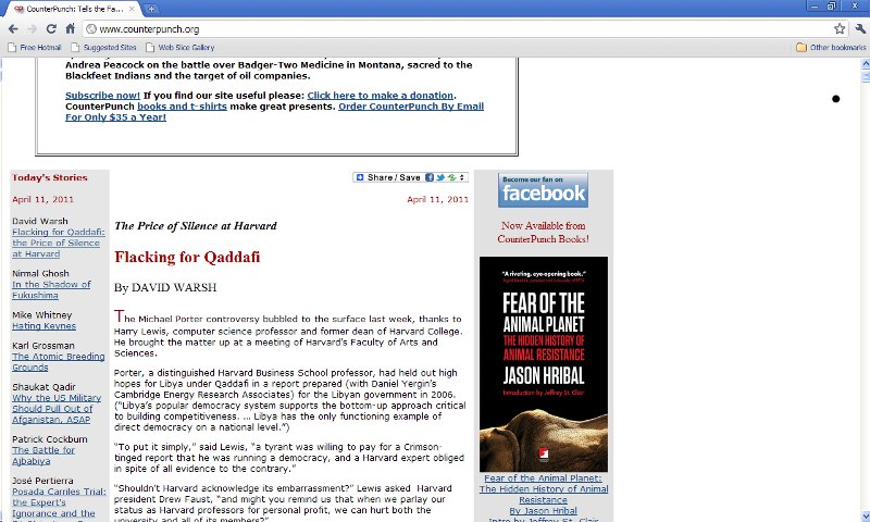
Here's another of the political websites I showed during class. It goes the other way from Capitolhill.blue... It's so plain and simple in design it's almost boring. Check it out: Counterpunch.org
Steve Womack
Apr 11, 2011
CapitalHillBlue.com
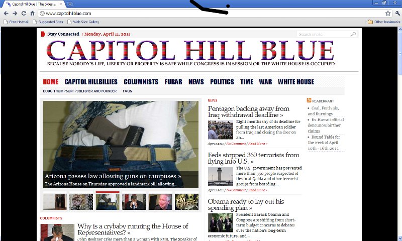
This is a website I check in regularly to, being the political junkie that I am. However, I find its design cluttered, frenetic, and too busy. See if you agree... www.capitolhillblue.com
James Muspratt
Apr 11, 2011
Exercise 17 (CSS3)
Please download Exercise 17
Here’s the scaling code I forget to include: it’s only for the last thumbnail in the gallery:
   -webkit-transform: scale(1.2);
   -moz-transform: scale(1.2);
   -o-transform: scale(1.2);
   transform: scale(1.2);
James Muspratt
Apr 13, 2011
Exercise 18 (Responsive Design)
Hi everyone, I won’t be able to make it to class tonight until around 7:30pm. Please try out the exercise below and see how far you can get with creating a flexible layout. If you get stuck or the instructions don’t make sense, get started on Project 3. Thanks and see you soon.
James Muspratt
Apr 13, 2011
Reading on CSS Transformations and Responsive Design
Hi everyone. Nice work on the flexible layouts tonight. For Monday the 18th, please continue to work on Project 3. Also read the following for more perspective on the techniques we covered this week:
CSS3
- Understanding CSS3 Transitions, by Dan Cederholm.
- Prefix or Posthack, by Eric Meyer
Responsive Design
- Responsive Web Design, by Ethan Marcotte.
- One Web, by Jeremy Keith
Richard Cook
Apr 14, 2011

Richard Cook
Apr 14, 2011

Richard Cook
Apr 14, 2011
Dollar Dreadful books
Dollar Dreadful Books, the book pages are set in very nice typefaces and rendered as PDFs.
Eric Andre
Apr 15, 2011
Poorly Designed Websites
I decided to show some poorly designed websites for this show-and-tell. I just thought it would be a nice break from looking at all of the slick innovative designs that are normally shown. The first one is a definite eyesore. It's composed of so many different pages and all of them are equally horrid. Interestingly enough the dokimos site was the least vapid, but the most painful.
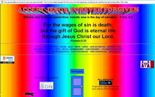
One thing about this site that really seemed strange to me was the door in the bottom center of the page. It takes you to the same place that the "menu" link takes you at the top navigation, but it restricts the use of pushing the back button to go back. This seems very manipulative to me as a user. One thing I actually do like about this site is the animated cat running backwards. Why backwards? It's completely absurd and that's why I enjoy it.
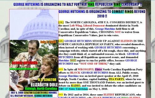
George Hutchins really needs to rethink his campaign plan. At least how it's represented on the internet. This site is just hideous. It's very difficult to read and leaves the user confused. Or at least it did me.
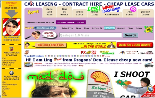
Ling has definitely got some cars... or does she/he? I can't tell. Maybe she's selling WMDs. Despite this hideous design I do enjoy the humour of the site.
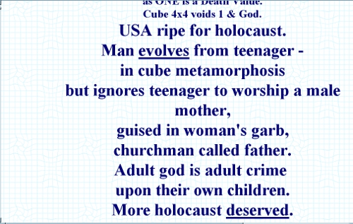
I didn't show the timecube website in class because it's mostly text. However, I encourage you all to take a look and read through this insane philosophy, or as they like to call it, cube truth. It's filled with absurd notions of how the world really is and how it truely operates. It's a good laugh all around. Not to be slighted by flat earth or hollow earth theories.
James Muspratt
Apr 17, 2011
Part 7: Floats
Floats are especially useful in particular situations: (1) wrapping type around an image, (2) arranging a “gallery” of elements into horizontal rows, and (3) creating a multi-column layout (where you can re-use the container structure on many pages).
Although floats are hard to control at first, they are often the smartest choice when you need to maintain flexibility: a floated element remains part of the document flow, so content that follows a float is “aware” of its size and placement. This is not the case with absolute or fixed positioning.
Text wrapping
Suppose you have an image you want to wrap text around. First, put the image inside but at the beginning of the paragraph:
<p>
<img src="headshot.jpg" id="headshot" />
Lorem ipsum dolor sit amet, consectetur adipisicing elit,
sed eiusmod tempor incididunt ut labore et dolore magna aliqua.
Ut enim ad minim veniam, quis nostrud exercitation ullamv
laborisnisi ut aliquip ex ea commodo consequat. ...</p>
Then, with CSS, float the image right:
img#headshot {
	width:100px;
	float:right;
	}

By default, the text will wrap around your image.
Galleries
When you float an HTML element you are declaring that (a) it should go as far as possible to the left or right, and (b) that the elements that follow it should be pulled up next to it. This means we can apply a float to a whole class of items to create a gallery of items that flow into rows:

To achieve a layout like this, we write a rule that floats all the items (.item) to the left. It is always a good habit to declare a width on any element that you float: Internet Explorer will often mess up the layout without it. Notice that we also float the containing div (#wrap): this is especially necessary when styling the container with a background color or border. Without it, the container “collapses” to a height of zero because it contains only floated content, and your border turns into a flat line above the gallery.
#wrap {
	float:left; /* Float the container! */
	border:1px solid black;
	}
.item {
	float:left;
	width:100px;
	height:100px;
	background-color:#cbfeff; /*blue*/
	}
Multi-Column Layouts
“Opposing” floats (one div floated left, the other right) are good for creating a structure of containers that stay put no matter what content you put in them. As long as you set a width on them, they will expand and contract vertically, sitting side by side no matter which column happens to contain more content. This means you can repeat the structure over a series of pages (linking all your pages to the same stylesheet), recycle the id names, and just change the content for each page.
Here is a simple pair of columns. Notice that we float the container again, float the child divs in opposite directions, and are sure to declare widths on everything.

#wrap {
	float:left; /* Float the container! */
	border:1px solid black;
	padding:70px 30px;
	width: 740px;
	}
#main {
	float:left;
	width:500px;
	background-color:#fff8ca; /*yellow*/
	}
#sidebar {
	float:right;
	width:220px;
	background-color:#cbfeff; /*blue*/
	}
Clearing
Floated elements have the annoying property of pulling up content that follows them, even when that content isn’t itself floated. To prevent this from happening, clear the float.
The clear property takes three possible values: left, right, or both. Most of the time (when you don’t need to distinguish between left- and right-floated elements), it’s simplest to just use clear:both;.
However, it usually doesn’t work to clear the elements you are floating: this prevents the float from working as intended. Instead, you want to clear whatever element follows the last floated element. For example, if you have a header that follows your gallery of floated images, target it with CSS and clear it.
h3 {clear:both;}
Now your heading will start on a new line as intended.
See also
- Exercises 3, 4, and 5
- CSS Floats, by Noah Stokes
James Muspratt
Apr 19, 2011
Part 8: Positioning
Sometimes floats aren’t enough to create a complex layout. Specifically, position:absolute, position:relative, and position:fixed enable positioning according to a coordinate system and allow elements to be “attached” to the browser.
Absolute Positioning
Before you absolutely position an element, you should understand that it will be removed from the regular document flow: that means that elements that come after it in the HTML source don’t “know” how much space the positioned element takes up, even if you’ve specified a particular height and width. Sometimes you can compensate for this issue by adding margins or padding to the later elements, but doing so relies on the positioned element never changing size or having content added to it.
By the same token, though, position:absolute; is particularly useful for overlapping one piece of content over another. The element you position will be removed from the document flow and moved to a point according to the pixel coordinates you assign. By default, those coordinates are measured from the top left corner of the browser.
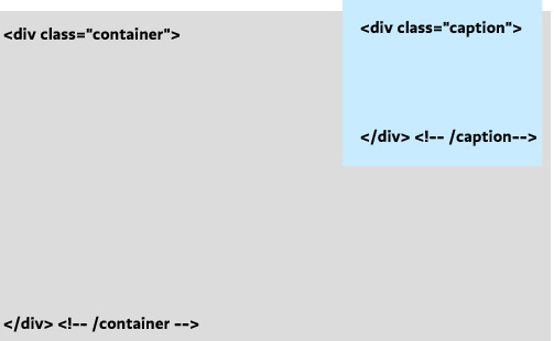
Suppose you have the following HTML, and you want to overlay your caption in the upper-right corner of the image.
<div class="container">
	<img src="cats.png" alt="My cats" />
<div class="caption">
	<p>My cats</p>
</div> <!--/caption -->
</div> <!-- /container -->
We’ll write a rule that positions the caption in the upper-right corner of the image. The position property is almost always accompanied by the top (or bottom) and left (or right) properties. These are distinct from margin-top and margin-left, and they default to 0.
.caption {
	position:absolute;
	right: 10px;
	top:-10px;
	}
Relative Positioning
Relative positioning works like absolute positioning, with two important differences: (1) the element is positioned according to the location the element would have been placed in regular document flow, and (2) the element’s height and width are preserved as if the element hadn’t been moved.
This sounds more useful than it is. Most often you will want to use another quirk of relative positioning: setting it on a container of an absolutely-positioned element resets the coordinate “origin” (zero point) to that relatively-positioned element’s top-left corner. This quirk is true for all three kinds of “positioning” that are not the default normal flow, but position:relative; is unique in that it won’t monkey with your container in any other way.
So in our example, we set the container to position:relative;, which has the consequence will then mean that our absolute positioning of the (child) caption will always be in relationship to its container, no matter where that container happens to be on the page.
.container {
	position:relative;
	}
.caption {
	position:absolute;
	right: 10px;
	top:-10px;
	}
Now we can be recycle the container and caption classes many times over on the page, knowing that each caption will always be positioned according to its container’s position.
Fixed Positioning
Fixed positioning positions an element according to the browser window, removing it from the document flow and keeping it there no matter where the user scrolls. It’s often useful for navigation bars, toolbars, or masthead elements that you want to stay on the screen. (Note that mobile Safari — the iPhone’s browser — does not support fixed positioning. Instead, it treats it like absolute positioning).
position:fixed is fairly simple to use, since it doesn’t matter where the element is nested in the source HTML or what comes before or after it:
#menu {
	position:fixed;
	bottom:20px;
	left:20px;
	}
Further Reading
Steve Womack
Apr 21, 2011
Author Websites--Deborah Crombie
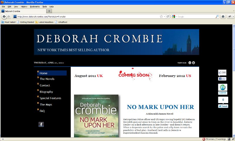
This is the first in a series of screen shots from websites built for authors. As you can see, they all seem to have certain elements in common and they aren't particularly impressive from a design sense.
Steve Womack
Apr 21, 2011
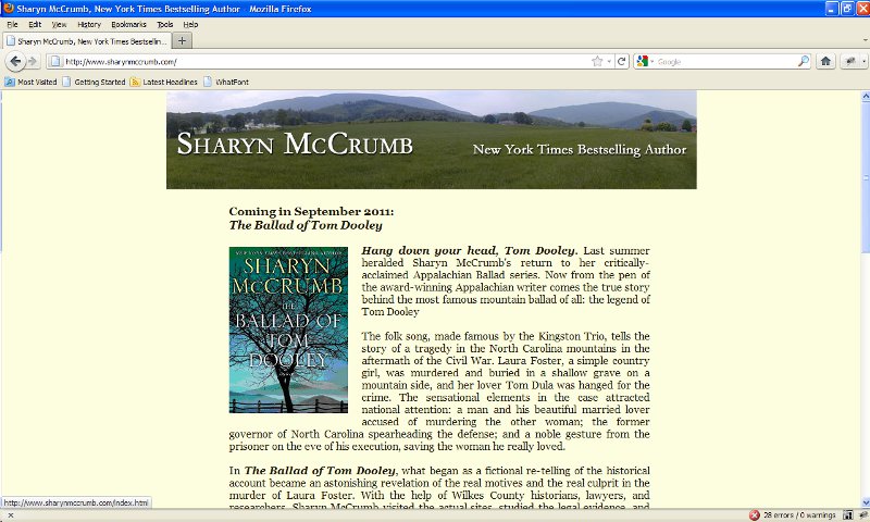
Sharyn McCrumb's website
This is Sharyn McCrumb's website. She's one of my favorite writers, but again, from a design sense, this website isn't going to knock anyone's socks off...
Steve Womack
Apr 21, 2011
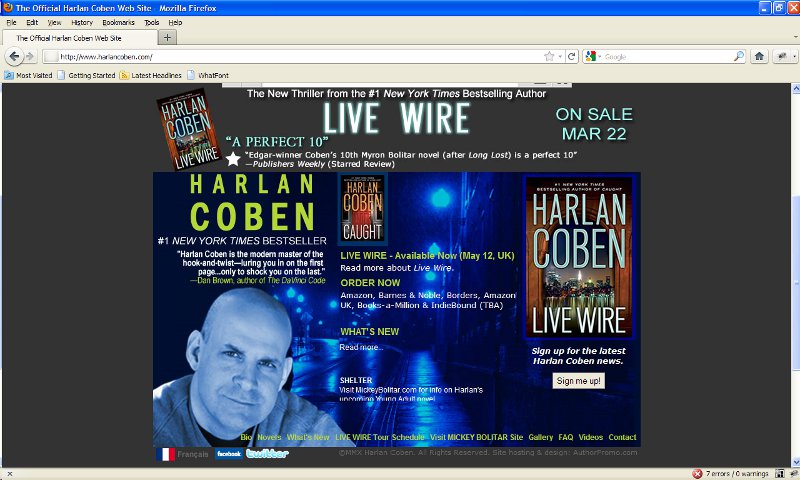
Harlan Coben's Website
This guy is one of the hottest-selling authors on the planet, but again, there's nothing particularly special about his website...
Steve Womack
Apr 21, 2011
Jeff Abbott's Website
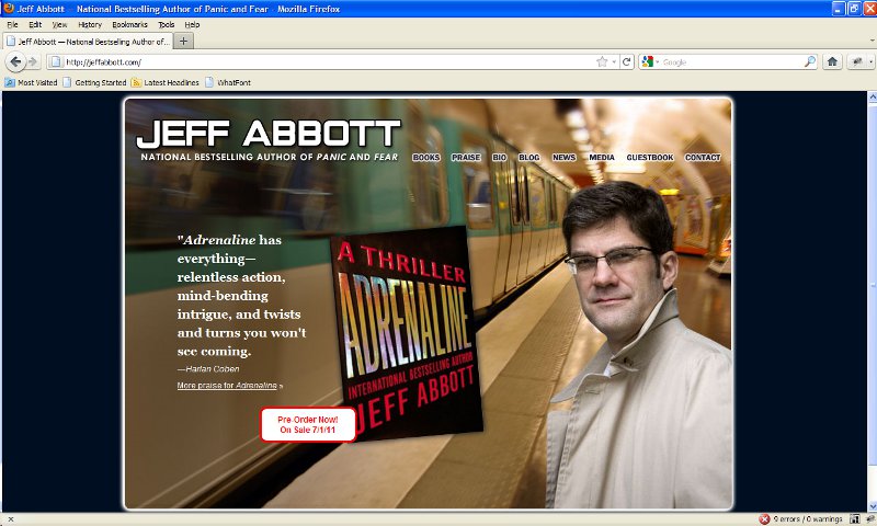
This author website seems to have a bit more going for it...
The challenge is to come up with a design that stands out from the pack, and I'm not at all sure how to do it. Any ideas would be welcome.
James Muspratt
Apr 21, 2011
Part 9: Intro to jQuery
Like HTML and CSS, Javascript is a “web standard,” meaning its functions and implementation are defined by a standards body. But historically browser implementation of Javascript has been inconsistent and buggy. Add in a legacy of bad coding practices (“hijacking the browser” with pop-ups, manipulated scroll bars, etc.), and its reputation is less than stellar. But browser support has improved in recent years, and today Javascript libraries can help smooth out the remaining differences.
Note that Javascript, a client-side scripting language, has no relationship to Java, a full-fledged programming language used on everything from servers to mobile phones.
Javascript should always be implemented in such a way that its absence doesn’t affect the core functionality of your site. This is sometimes called the principle of “graceful degradation” or “progressive enhancement.” Many screenreaders, mobile browsers (especially on non-smartphones), and older desktop browsers have limited or no support for Javascript — we still want our sites to be as accessible as possible for users (and search engines) using such software. You can think of Javascript as the third conceptual layer in the construction of a web page:
| Content Layer | Presentation/Style Layer | Behavior Layer |
|---|---|---|
| HTML | CSS | Javascript |
Libraries and Embedding
We’ll skip the basics of Javascript and jump into jQuery, a Javascript library that enables a huge variety of animations, page manipulations, and other tricks and enhancements. You can think of a library as a middleman that protects you from writing actual Javascript (which can be ugly and tedious) and instead lets you write clearer, simpler code in a syntax that builds on your knowledge of CSS. (Other popular libraries include Prototype, Mootools, and Yahoo’s YUI.)
With jQuery, you always add a <script> tag in the <head> of your page (usually after the CSS link) that embeds the library file itself (a chunk of illegible code). You then write your custom code after it to accomplish something specific with that page. Your custom code might well be written inline (between <script> and </script> tags) or linked to an external file. I usually put all my Javascripts in one folder and link to the files:
<script type="text/Javascript" src="js/jquery-1.3.2.min.js"></script>
<script type="text/Javascript" src="js/mycustomscript.js"></script>
In addition, jQuery supports a variety of plugins, which are themselves chunks of code or mini-libraries that extend the functionality of jQuery. If you want to use my all-time favorite slideshow plugin Cycle, you would include jQuery itself, then the Cycle plugin, and finally your custom code:
<script type="text/Javascript" src="js/jquery-1.3.2.min.js"></script>
<script type="text/Javascript" src="js/jquery.cycle.all.js"></script>
<script type="text/Javascript" src="js/mycustomscript.js"></script>
Javascripts work by manipulating your page, or specifically, the “Document Object Model,” which simply means the structure of nested tags that comprise your page. This manipulation generally only affects the page’s contents as they exist in the memory of the browser. No files are changed, and unless you are using advanced techniques, reloading the page will reset any manipulations Javascript has performed.
An Example
Take a look at this Expand/Collapse Demo from Soh Tanaka. If you view source and scroll past the inline CSS, you’ll see two lines of Javascript. First, the jQuery library is included — here it is being pulled straight from the jQuery serves (compared to embedding a local copy, this has the downsides of being slower and reliant on jQuery.com’s servers). Notice how the script tags open and close without any text inside them:
<script type="text/Javascript" src="http://code.jquery.com/jquery-latest.js"></script>
Then comes a chunk of custom jQuery code, written inline between a <script> and a </script> tag:
<script type="text/Javascript">
$(document).ready(function(){
	$(".toggle_container").hide();
	$("h2.trigger").click(function(){
		$(this).toggleClass("active").next().slideToggle("slow");
	});
});
</script>
You don’t need to understand all the syntax here to use and adapt this script to your site. The key points are as follows:
jQuery targets HTML elements using the CSS selectors that you already know and love. In the above example, any <div class="toggle_container"> is hidden as soon as the page is “ready” (i.e. enough of it has loaded for the script to safely start working). Then a function is attached to each <h2 class="trigger">: when clicking the h2, the function adds a class to that h2 named active; it then looks for the HTML element that follows the h2 in the HTML and slides it open slowly.
Finally, even though your HTML is not “really” being altered, you can still style the altered state of the page. In the above example, you can write a CSS rule that changes the h2 only when it has a class of active.

In the above example, the “+” icon is a background image attached to every h2.trigger via CSS:
h2.trigger {
	padding: 0 0 0 50px;
	margin: 0 0 5px 0;
	background: url(h2_trigger_a.gif) no-repeat;
	height: 46px;
	}
Since we know the h2 will receive an additional class of active when it is clicked, we can write a rule for that situation (even though it doesn’t occur in the page as we have written it). In this case the designer has embedded the “-” symbol in the same background image, so it can be revealed simply by shifting its position:

h2.active {background-position: left bottom;}

As stated before, jQuery is not literally rewriting your HTML file — it is editing a virtual copy that sits in the browser’s memory. To see what it is doing, make use of the browser tools available for Safari, Firefox, and Chrome: they will show you the altered “state” created by the Javascript.
Further Reading
James Muspratt
Apr 22, 2011
Critiques on April 25, 27
Next week we will be doing critiques. I realize this project is more hurried than the last, and there is a lot of new material. Nevertheless, it is important for you to get your sites to a state that you can get meaningful feedback from the group. Please be ready to do a quick overview of the material you are working with, then show your design concept (wireframe and/or photoshop mockup), and finally your in-progress HTML and CSS, even if they are not fully functional. If you need help accomplishing some specific goal with your code, feel free to email me.
- Group A (Monday, April 25)
- Adam Agee
- Eric Andre
- Richard Cook
- Mark Fentriss
- Aaron Johnson
- Katelyn Joughin
- Group B (Wednesday, April 27)
- Don Mann
- Xavier Payne
- Courtney Spencer
- Jill Thompson
- Kelsey Ullrich
- Steve Womack
Good luck with all your work as the semester comes to an end!
Eric Andre
Apr 23, 2011
More info on media queries and their usefulness
I've really wanted to embrace this fluid, flexible and responsive web design. I think it's the best darn thing ever. Here is a really good article about media queries. We discussed this a bit in class and had an exercise on it, but this goes a little more in-depth.
A List Apart: Responsive Design
I really enjoyed the "responsive architecture" description.
James Muspratt
Apr 23, 2011
Part 10: Intro to CSS3
Most of the CSS properties we have used so far are technically from the CSS 2.1 specification, and browser support for them is quite good in the latest versions of the major browsers (Internet Explorer 8 and 9, Safari 5, Firefox 3 and 4, and Chrome 11).
CSS3 is not finalized, and browser support is very uneven, but its new properties enable all sorts of interesting styles and animations. Very often you will have to declare the same property and value multiple times, once in a generic way, and several times again with “vendor prefixes”, similar-looking properties that target particular browsers or rendering engines. -webkit targets Safari and Chrome, -moz is for Firefox, and -o is for Opera. Be sure to write the vendor-specific declarations first, followed by the generic declaration. That way, any browser that supports the generic declaration will use it.
In a few years we will be able to drop the vendor prefixes and just use the generic properties, but we’re stuck with them for now. For more on the reasons behind vendor prefixes, read Prefix for Posthack, by Eric Meyer. For a brief look at browser support, look at Deep Blue Sky: CSS3 Support by Browser.
Properties and Syntax
RGBa Color Values
We’re used to specifying text, border, and background colors as English words (color:gray;) and hexademical codes (color:#555555;). The RGB model lets you specify colors with red, green, and blue values (each numbered 0 to 255). Like hexadecimal codes, these are visible in the color pickers in Adobe programs.
#main a {
	color: rgb(76,149,224); /* blue */
	}
RGBa builds on this syntax: you use RGBa to specify an RGB color and then an amount of alpha transparency, which uses a scale of 0 to 1, where 1 is the normal, opaque setting.
#main a {
	color: rgba(76,149,224, .8); /* blue with 80% opacity */
	background-color: yellow;
	}
Why have transparency on your text, rather than just pick a lighter color? You might want to allow a background color — or more often a texture or image — to mix with the text color. Keep in mind you can use RGBa wherever colors are specified. Here’s how to create a semi-transparent border on div:
div#main {
	border: 10px solid rgba(255, 255, 255, 0.3);
	}
Opacity
The opacity property controls the transparency of the entire contents of the HTML element, images, background images, and text included — not just the background. Unfortunately, this is a property that neither Internet Explorer 6 or 7 supports. Although Microsoft hasn’t adopted the standard vendor prefix syntax, you can add the Explorer-specific filter property. Use the syntax below:
#main a:hover {
	filter: alpha(opacity=80);
	-moz-opacity: .8;
	opacity: .8;
	}
Rounded Corners
Note that border-radius might better be named “box-roundness” — you might well put a background color on an element and round its corners without adding a border at all.
#main  {
	-webkit-border-radius: 12px;
	-moz-border-radius: 12px;
	border-radius: 12px;
	}
CSS columns
CSS3 lets you put a single chunk of text into multiple (equal-size) columns, without floats or complex positioning. This is an impressive trick, but in practice columns have big usability problems. You don’t know the height of the user’s browser window, and so anything but very short columns might require the user to scroll up and down repeatedly to read your text. The basic syntax for the two approaches is below. See Quirksmode’s article on CSS3 columns for more info.
/* Define the column COUNT */
 div#main {
	/* column count */
	-moz-column-count: 3;
	-webkit-column-count: 3;
	column-count: 3;
	/* gutters, aka gaps */
	-moz-column-gap: 20px;
	-webkit-column-gap: 20px;
	/* rules: same syntax as borders*/
	-moz-column-rule: 1px solid black;
	-webkit-column-rule: 1px solid black;
	}
/* Define the column WIDTH */
 div#main {
	/* column width */
	-moz-column-width: 150px;
	-webkit-column-width: 150px;
	column-width: 150px;
	/* gutters, aka gaps */
	-moz-column-gap: 20px;
	-webkit-column-gap: 20px;
	/* rules: same syntax as borders*/
	-moz-column-rule: 1px solid black;
	-webkit-column-rule: 1px solid black;
	}
Multiple Background Images
CSS3 lets you attach multiple background images to a single element. The trick is to use comma-separated values and the verbose, hyphenated properties instead of the customary, all-in-one background property:
#side {
	background-image: url(background1.png), url(background2.png);
	background-position: 0 0, 10px 10px;
	}
Drop Shadows
Drop shadows are easily generated with CSS3, too, and you can control the shadow offset (how far it is shifted from the element’s edges), how blurry the shadow is, and the shadow color. The syntax goes like this: offset-x offset-y blur-amount shadow-color:
img {
	-moz-box-shadow: 0 0 10px #00b4ff;
	-webkit-box-shadow: 0 0 10px  #00b4ff;
	box-shadow: 0 0 10px #00b4ff;
	}
Transformations
CSS3 Transformations manipulate HTML elements in ways that older CSS properties can’t. You can combine these effects with smooth CSS transitions (below) for a more fluid effect. Here’s a quick way to scale images up to 120% size on hover:
#img:hover {
	margin:0;
   -webkit-transform: scale(1.2);
   -moz-transform: scale(1.2);
   -o-transform: scale(1.2);
   transform: scale(1.2);
   }
Other transform values include rotate(), skew(), and translate().
Transitions
Probably the most interesting part of CSS3 is enabling transitions. The most common use is to make the change from a normal state to a hover state gradual, rather than instantaneous (this effect is very common with Flash).
For instance, suppose we have already created a few links that have a class of “button”, and we set them to be blue. On hover, we change them to green and move them 2 pixels down (using margin-top). By default, these changes kick in the moment the user’s mouse passes over the button. Adding a smooth transition requires just four lines of CSS3 code:
a.button {
	color:blue;
	-webkit-transition: all 1s ease;
	-moz-transition: all 1s ease;
	-o-transition: all 1s ease;
	transition: all 1s ease;
	}
a.button:hover {
	margin-top:2px;
	color:green;
	}
Notice that you must put the transitions on the a.button style, not on a.button:hover. This seems illogical, since the effect only happens on hover, but remember that CSS uses pseudo-classes for other states besides hover: a:link, a:target, a:active, a:visited. Since the transition would generally be intended to occur for those states too, it was decided to simplify things by requiring the transition info only on the default style.
Our transition is composed of three values: first, we specify which properties should be affected by the transition. Most of the time, all is the easiest choice. However, if we’d only wanted the color change to be gradual, and the margin change to happen instantly, we could have written: transition: color 1s ease;. Second, we write the transition duration, in seconds. Finally, we specify easing. Easing is mostly visible when moving, scaling, or rotating an element: it means making the animation fast at the slow at the beginning and end, making it act more like a real life object. Your options include linear (no easing), ease-in, ease-out, and ease. Again, most of the time ease is a good choice. See Dan Cederholm’s Understanding CSS3 Transitions for more.
Further Reading
- Exercise 17
- Prefix or Posthack, by Eric Meyer
- Deep Blue Sky: CSS3 Support by Browser
- Quirksmode’s article on CSS3 columns
- Working with RGBa Colour, by Drew McLellan
- Understanding CSS3 Transitions, by Dan Cederholm.
- Zen Element’s CSS3 Introductions
- West Civ’s Interactive Transformation panel
James Muspratt
Apr 23, 2011
Part 11: Intro to Responsive Design
Philosophy
Responsive design is the evolution of a general principal that promotes flexibility and accessibility over “pixel precision.” It has picked up a lot of steam in the past two year as mobile internet use has surged and the debate over the roles of websites versus proprietary apps has raged.
Big media sites often dedicate entire mini-sites to mobile users: sometimes known as the “m dot” approach, these sites display much of the same content as their “desktop” versions, but simplify the layout to a single column, skip the ads and video features, and move the navigation to the top of the page. Take a look at the Guardian mobile, BBC News mobile, or Facebook mobile for examples. The logic used to make a good amount of sense: site developers knew that mobile phones have low-resolution screens, expensive internet access rates, and that users would be in a hurry to see the content, preferably unadorned by a desktop-optimized design. Therefore, they reason, those users should be re-directed to a separate “mobile experience” specifically tuned to their needs.
But this logic has started to fall apart in recent years. What about tablet computers — are they “mobile”? Should iPad users be sent to mobile-optimized sites or given the desktop version? What about iPod touches connected via wifi, which have high bandwidth and higher resolution screens than computers from the mid-90s? For that matter, why should desktop computer users always get image-heavy versions of the site? Things get even more problematic when developers have to manage multiple URLs that serve up similar content: when a desktop user emails a link (e.g. http://nytimes.com/obama-article) and it is opened by a mobile user, should it redirect to http://m.nytimes.com/obama-article? What if content the desktop user was referring to is now missing? And what about search engines — should the mobile versions of all pages be hidden from them, so they don’t water down the SEO value of the desktop URLs?
Responsive design does not answer all of these questions, but it certainly takes a new approach: We shouldn’t slice our website up into multiple versions based on our guesses about the needs that go with particular devices: after all, the mobile user might well want the “full” experience, while the desktop user might still be on dial up or like to keep his or her browser window skinny.
It is better and simpler, the argument goes, to create a single website that adapts to particular features of the user’s software. This is distinct from the discredited practice of using Javascript to “sniff” the user’s particular browser or OS, since feature detection is “future compatible”: that is, it is likely to keep working as new versions of the browsers are introduced. Jeremy Keith explains this argument well in his post One Web.
As described by designer/developer Ethan Marcotte, today responsive design can take advantage of at least three techniques: (1) a flexible grid design, (2) images that scale, and (3) media queries. Combining the three techniques enables the layout of a site to adapt to radically different browser widths.
Step 1: The Flexible Grid
It is common to use a grid system to organize information into a set of visually-pleasing columns. Like print designers, web designers often like to use particular mathematical relationships to create their grid: a sidebar’s width might be a half or a third of the main column’s width, and then contain elements that are each half of that width. (See the 960 grid system for one popular framework).
Suppose you design such a layout using a series of floated div containers, each set to pixel widths. (You probably would not set any heights with CSS, but instead allow the content to define the height of each div). Your HTML outline might look like this:
<div id="content">
	<div id="main">
	[content]
	</div> <!-- /main -->
		<div id="side">
			<div id="bio">
			[content]
			</div> <!-- /bio -->
			<div id="links">
			[content]
			</div> <!-- /links -->
		</div> <!-- /side -->
</div> <!-- /content -->
And your CSS might look like this
content {float:left; width:800px;}
#main {float:left; width:475px;}
#side {float:right; width:300px;}
#bio {float:left; width:145px;}
#links {float:right; width:145px;}

Creating a “flexible grid” means converting those pixel values to percentages. But first, we need to set an overall maximum width for our page, to prevent lines of text from getting too long. So even though our pixel-width for content was 800 px, we might choose a larger maximum value for the flexible design.
#content {max-width: 1200px}
Now we dive into the main work of converting container widths from pixels to percentages. The key point here is that you must always calculate the percentage based on the parent container of your element. In other words, when we set the width of <div id="bio">, we should divide 145 px by 300 px (since side is its parent), not by 800 px. Ethan Marcotte describes the formula as follows: target ÷ context = result, where “context” means the parent container. Following this procedure, we get the following:

content {float:left; max-width:1200px;}
#main {float:left; width:59.4%;}
#side {float:right; width:37.5%;}
#bio {float:left; width:48%;}
#links {float:right; width:48%;}
I’ve left out margins for simplicity, but they follow the same rules. margin-right:10px on the main div would come out to margin-right: 8%;
This is already a much better web layout: users with Cinema Displays will actually get the benefit of having such a large screen, while iPad users won’t have to scroll sideways or zoom in and out.
Step 2: Allowing Images to Scale
Images, of course, have defined dimensions by default: for a responsive design, you will usually embed relatively large-size images in your pages (maybe 1000 px wide), and then allow the browser to scale them down as needed. To allow images to scale, we first need to remove any height and width attributes from the image tags themselves, since they will prevent the scaling from working: So <img src="myphoto.jpg" alt="My photo" width="200" height="100" /> becomes <img src="myphoto.jpg" alt="My photo" />. (Both versions are valid XHTML, though only the former allows the browser to draw the shape of the image before it has entirely loaded).
Second, we need to write a max-width declaration for images that we want to scale. The beauty of max-width is that it scales the images down when their container gets skinny (100% means 100% of the container), but it doesn’t scale the image up when the container gets very wide (which would cause pixelization). So we target the content images with a CSS rule:
#content img {
	max-width:100%;
	}
Step 3: Adding Media Queries
Even a flexible grid, however, starts to break down as the browser gets extremely skinny. Media queries — a CSS3 technique — come to our rescue here. This special syntax allows us to change the layout based on the browser’s width. We can therefore create three (or four, or five…) layouts that kick in at particular widths. And since our design is percentage-based, the site will continually adapt itself to the browser within each of these layouts.
Media queries use a strange syntax and add an extra nesting of curly braces, but if you follow the format below, you should be able to get them working. And because they contain regular CSS rules, you are free to change any element (such as font-size) for any of the layouts.
Here we just use media queries to turn off floats and change widths, creating a two-column layout optimized for smaller screens and a single-column layout optimized for phones.
content {float:left; max-width:1200px;}
#main {float:left; width:59.4%;}
#side {float:right; width:37.5%;}
#bio {float:left; width:48%;}
#links {float:right; width:48%;}
/* Begin medium, two-column layout */
@media screen and (min-width: 601px) and (max-width: 800px) {
	#bio, #links {float:none; width:100%;}
}
/* end two-column layout*/
/* Begin single-column layout */
@media screen and (max-width: 600px) {
	#main, #bio, #links, #side {float;none; width:100%;}
	}
}
It’s important to note that these techniques are only part of the picture, and “responsive design” may end up meaning different things for different websites. More importantly, there are techniques still being developed that will help responsive design live up to its own philosophy: chief among these are techniques for serving up images appropriate to the size at which they will be rendered, rather than wasting bandwidth by serving very large images to all users.
Bonus Round
Safari for iOS (aka “MobileSafari”) assumes that websites are 980 px wide, which will usually defeat the “small screen” media query you write. To fix it, put the following meta tag in the <head> of your pages:
<meta name="viewport" content="width=device-width, initial-scale=1.0" />
Further Reading
- Exercise 18
- Responsive Web Design, by Ethan Marcotte.
- Fluid Images, by Ethan Marcotte.
- Experimenting with responsive design in Iterations, by Diy Solar
- Context, by Jeremy Keith
- One Web, by Jeremy Keith.
- Controlling text size in Safari for iOS without Disabling User Zoom
Mark Fentriss
Apr 25, 2011
Simplified Safety
A content heavy shopping site for safety equipment. The tabs at top have drop down lists which is not new, but the delay seems to be too long. Included is the contact drop down which is a nice feature because it saves one from having to visit another page.
The black content titles are hover reveals. They are able to hide descriptions to make the page a little cleaner and provide content when one may choose to see it.
Kelsey Ullrich
Apr 25, 2011
kelsey show and Tell 2
The FLOWmarket is a company that sells non-tangible items in small cans. Initially, I found the product really interesting but I also think the websThe FLOWmarket is a company that sells non-tangible items in small cans. Initially, I found the product really interesting but I also think the website is very nice being only in black and white and set in a very basic beautiful type. It matches the product very well.

Oliver Kavanagh's portfolio really caught my eye with the overlapping and very LARGE typography. Even though it is very interesting to the eye, I don't think its the most effective as far as navigation goes.
Mark Fentriss
Apr 25, 2011
Seavees
This is primarily a branding site which also offers shopping. There is not a way to reach the landing page unless you visit the site again. There are inconsistencies in the navigation of different shopping pages. Requires one to click on several pages if you saw something you liked but wanted to return to it.
James Muspratt
Apr 28, 2011
Khoi Vinh on Columns
Interesting take on setting blocks of text in columns on the web from Khoi Vinh:
I take a different position, though. I think that the desire to approach screen-based layout with columnized text is misguided. Multiple columns are an effective layout technique in print because they improve legibility for long blocks of text. But for digital media, it’s my feeling that they make it harder to read text.
Adam Agee
May 3, 2011
Adam's Show and Tell 2

I shared this site because of the cool ping image in the background that changes from robots to zombies.
Adam Agee
May 3, 2011
Adam's Show and Tell 2 again

I shared this site because it inspired to to build my single page scrolling site and to make my logo in the top left change colors using a transparency like I did. Hope you all enjoyed!
James Muspratt
May 3, 2011
An Event Apart
Jeremy Keith is live-blogging the An Event Apart web conference going on in Boston this week. He’s written up notes from all of the presentations; the ones by Luke Wroblewski, Ethan Marcotte, and Jeffrey Zeldman are particularly relevant to the themes of information architecture and responsive design that we’ve been discussing.
James Muspratt
May 5, 2011
Web Servers and Hosting
Here’s a quick summary of last night’s review of servers and hosting.
Buy a domain name
A domain costs $8-10 per year. You buy it through a registrar who may or may not be the same as your web host. It usually makes sense to keep those two things separate, so that you don’t get locked in to one provider (especially when they raise prices after the first year). I recommend NameCheap. Other good registrars are Gandi and Hover. Marco Arment, an iPhone app developer, has some theories about the pitfalls and problems with registrars.
Sign up for hosting
Hosting costs $10-20 per month (unless your site has unusual needs or receives a lot of traffic). Some of the most reputable hosts are MediaTemple, Linode, and Slicehost. They all have $20 per month plans.
Make sure you choose a host that lets you run PHP 5 and MySQL. Ideally they should offer sFTP, in addition to FTP: it means your password and files get transmitted much more securely. Web hosts try to distinguish themselves through spec lists (20GB of storage, 200GB of bandwidth, 20 Databases!). But at least in the short term, what matters more is their customer service: if something goes wrong, or you can’t get something configured, you want them to answer your support request within a day or two. All that said, there are some budget options: Bluehost has a $6/mo. plan.
Once you have both a domain name and a host, you connect the two so that the domain name is associated with your server space. Your host will give you four to six Domain Name Server addresses for you to punch into your registrar’s control panel. After doing so, it usually takes 24 hours or so for the domain connection to “propagate” throughout the internet. After that, you’re in business: the files you FTP to your server space will be served from your domain name on the web.

Here I’ve typed in those four DNS addresses to tell Namecheap that the domain “jamesmuspratt.com” is hosted over at Joyent. You only have to do this once, unless you change hosts.
Get an FTP program
Some web hosts allow you to upload files to your server space over a web interface, but that gets tedious quickly. Instead, you should use an FTP program. Transmit is the hands-down winner here. It’s $39 but that gets you a whole bunch of features that are extremely useful, so it’s worth it in the long run. Fetch ($29) is a popular alternative, and a free option is Cyberduck, which is open-source.
James Muspratt
May 5, 2011
Project 3 is up
Your work is now up on the projects page.
Thank you all for a great semester! Please feel free to email me this summer if you have questions, thoughts, or suggestions about Web 2. This site will be sticking around until the fall, at which point I’ll probably move it to a different address (and post a note here).
Eric Andre
May 18, 2011
Life After Web 1
While looking for documentation on HTML5 I found this really interesting site on the history of HTML. It describes some very interesting things. It also has some archived e-mails from 1993 about developing new tags and trying to adopt web standards. I also learned a little more about MIME types and XHTML. You should check it out if you're really interested in learning more about web development.
Here is an interesting web article on the trends in web development for 2011. Some of these we focused on in the Web 1 class. One thing I was intrigued by is the QR (Quick Response Barcode). You can generate different types of QR barcodes here. The QR barcode seems like an interesting way to advertise websites and even bring data and information to the public.
James Muspratt
Jun 7, 2011
Responsive Web Design, the book
Ethan Marcotte has just published Responsive Web Design, a short book on the techniques described in some of the articles we’ve read. And the ebook version (which includes a plain old PDF) is just $9.