Mark Fentriss
Mar 7, 2011
Team Green Fundraising
The view of this site does not appear to change when clicking a button on a laptop screen because all the content is lower. It does view fully on a larger desktop screen.

The view of this site does not appear to change when clicking a button on a laptop screen because all the content is lower. It does view fully on a larger desktop screen.
This article has some great information about overall web design and meta tags, with some informational links.
I am moving the final due date for Project 2 to April 4. As with Project 1, you are responsible for bringing your final files into class on the due date — late submissions will not be accepted. We will be doing mid-project critiques the week after our break: Group B will present their work on March 21, while Group A will present on Mar 23. If you are behind with your design and/or code, please use March break to catch up.
Finally, here is the updated schedule for Show and Tell through the end of the semester.
| 3 09 | katelyn |
| 3 14 | (break) |
| 3 16 | (break) |
| 3 21 | (critiques) |
| 3 23 | (critique) |
| 3 28 | aaron |
| 3 30 | don |
| 4 4 | xavier, jill |
| 4 6 | rex, courtney |
| 4 11 | adam a |
| 4 13 | eric, richard |
| 4 18 | mark, kelsey |
| 4 20 | steve, adam f |
| 4 25 | (critique) |
| 4 27 | (critique) |
| 5 02 | — |
| 5 04 | — |
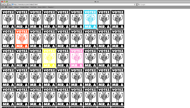
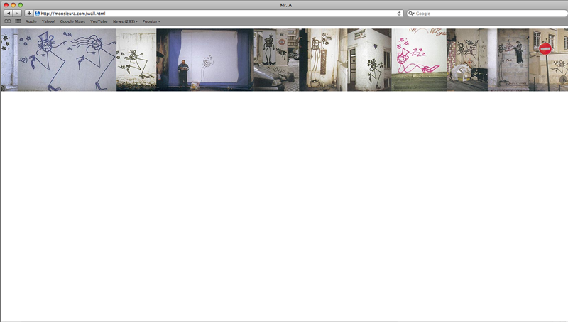
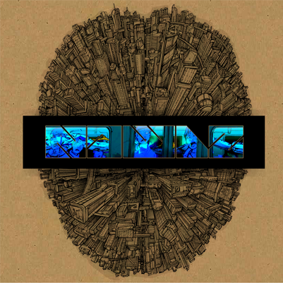
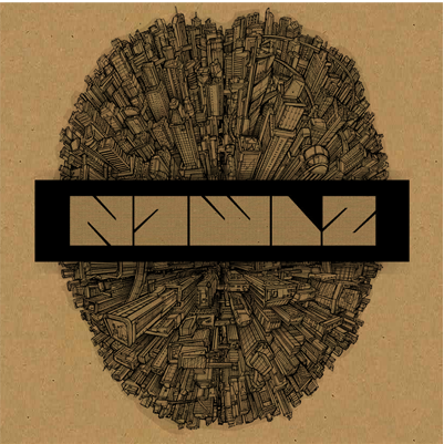
 This is a site from a graffiti artist named Mr. A. He has a very simple site, but the political campaign concept is very strong.
Please download the exercise files to your machine.
 WOW, I finally got it right.
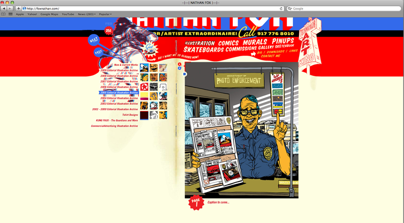
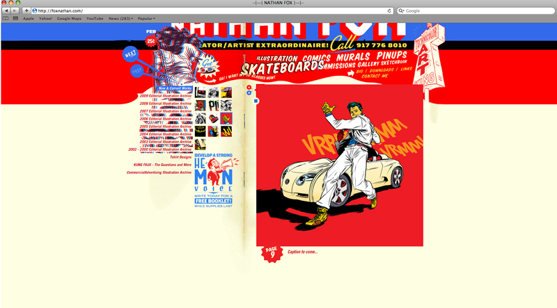
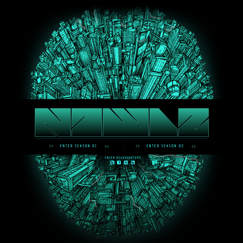
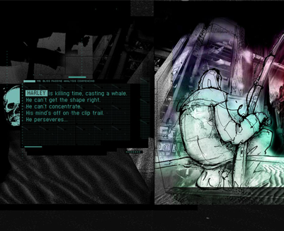
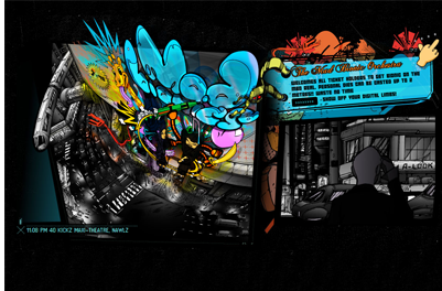
As I stated before, I chose this site for the way the type interacts with the images through out the site. Also the different font choices.
Here are a few more images from the site that shows the images through the text. This happens when you hover over the season selections in the main menu of the comic.
WOW, I finally got it right.
As I stated before, I chose this site for the way the type interacts with the images through out the site. Also the different font choices.
Here are a few more images from the site that shows the images through the text. This happens when you hover over the season selections in the main menu of the comic.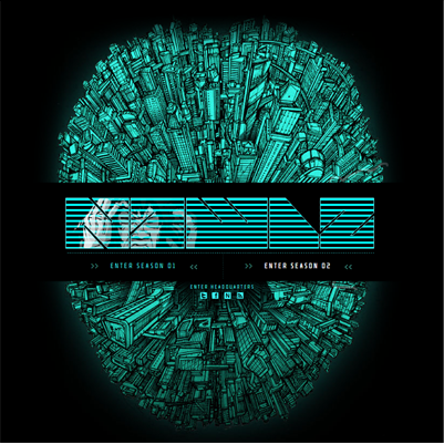
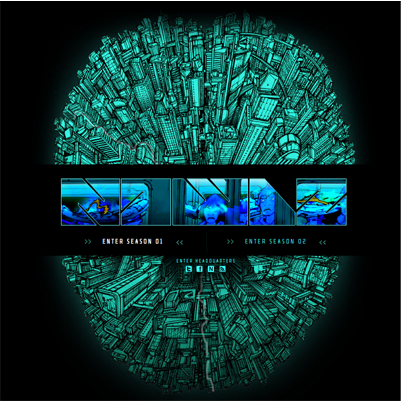
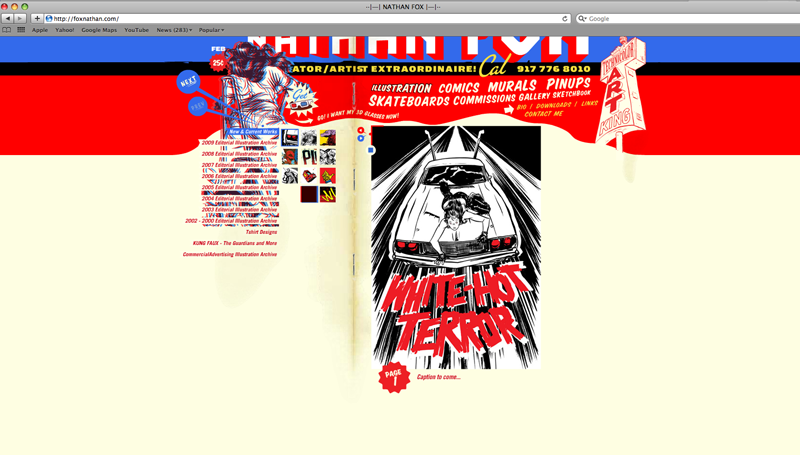
These last two are secondary screens inside the two different chapters.
And now here are some screen shots that show some of the different fonts used in the design of the site.

For those who haven’t posted images to the site yet, here’s a quick run-down on how to do so.

<img /> tag has an alt attribute that describes it in brief, and be sure to wrap it in <p> tags. Finally, since the site uses a responsive design that allows images to scale, remove any height and width attributes completely. The final result should look something like:<p><img src="http://web1.jamesmuspratt.com/images/1.jpg" alt="My cat on my desk" /></p>Please do the following for Monday:
Floats and positioning are big topics, but it’s likely you’ll need one or both techniques for Project 2. The following articles cover these two topics in different ways and with different amounts of detail; I think those differences will actually help you get a handle on the material faster.
By now you should have a fairly clear idea of how you will present the information — whether informational or biographical — in Project 2. The goal of wireframing is to start making decisions about the particular content, layout, and hierarchy of your page(s), without worrying too much about typography or color. Your wireframe can be sketched or drawn in Illustrator or Photoshop, and you can render blocks of text as a few horizontal lines and images as boxes with X’s through them.
You should use the looseness of the format to work out fundamental issues like the sequence, scale, and relationship of your elements. What will your site visitors look at first, and how will they know what they can click on and where they should start reading? Most likely your first few attempts will reveal potential problems in the layout or the hierarchy of the content — give yourself time to go back and try solving the problem in different ways.
I haven’t found very many good articles on wireframing. Instead I’d recommend just browsing this Flickr gallery, Adaptive Path’s sketchboards, Web Design Ledgher’s gallery, and the Wireframes for the Wicked presentation to get an idea of the variety of methods and levels of details that designers use.
Good luck!
Please download the files to your machine.
My web site for illustration. I show only adobe illustrator pieces on this site. It was designed last year by me, before web class. I created it using Adobe Illustrator, Photoshop and Dreamweaver.
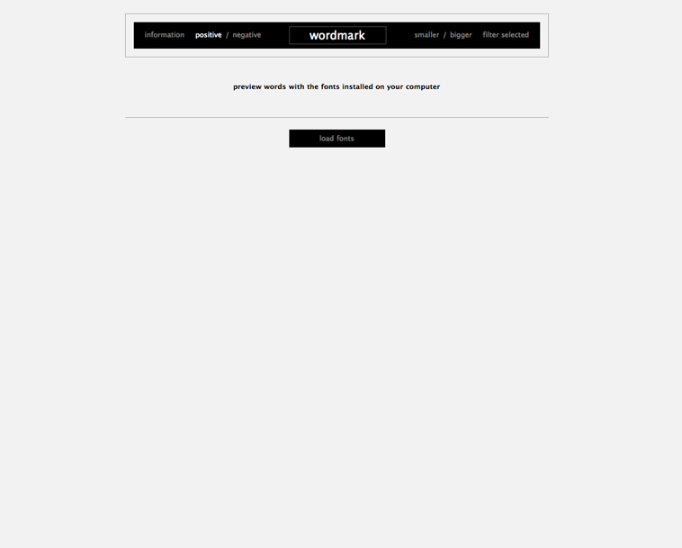
Word mark is a great type viewing web site. It shows all fonts on the users personal computer. A great working tool for designers.
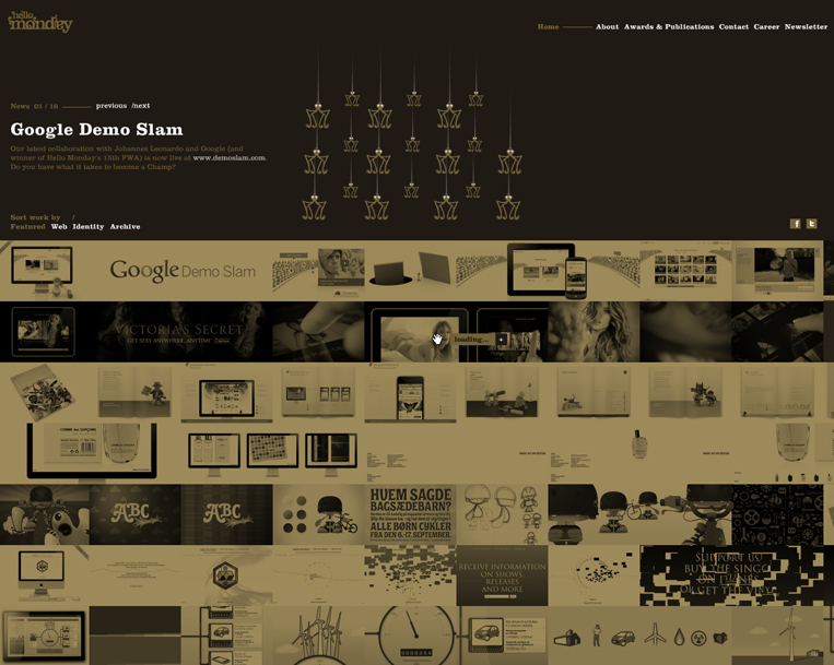
A design company web site with a great little interactive opening page. Navigation is a little hard to find
A web site with lots of information. Very busy and interactive. This site is designed by international web and information design company
20 things I learned is a promotional web site from google. It has lot's of additional information about web design in a cute children's book format.

Some more sites to look at if you’re taking an infographic approach to Project 2:
The tool I showed you tonight is called Textile. The idea is that it will take plain text and turn it into valid HTML, wrapping paragraphs with <p> tags and converting common ASCII characters (apostrophes, quotation marks, dashes, etc.) into their proper typographic HTML entities. You can also output certain HTML tags through special syntax. (*Some text* will output <strong>some text</strong>, for example. The best way to understand it is to try running different kinds of text through it and reading the “Phrase Modifiers” on the page.
Here are the web site I showed during the last class.
by far my favorite was major output. I love how the only content on the page is pixel art made directly on the page and submitted by the visitors. When you see 8-bit pixel art you tend to think that it's really easy, but it's not. Especially with todays computers. It's actually very difficult to find programs, if any, that can do things this simple. Also, because of how limited pixel art is it forces you to be extremely creative within those limits.
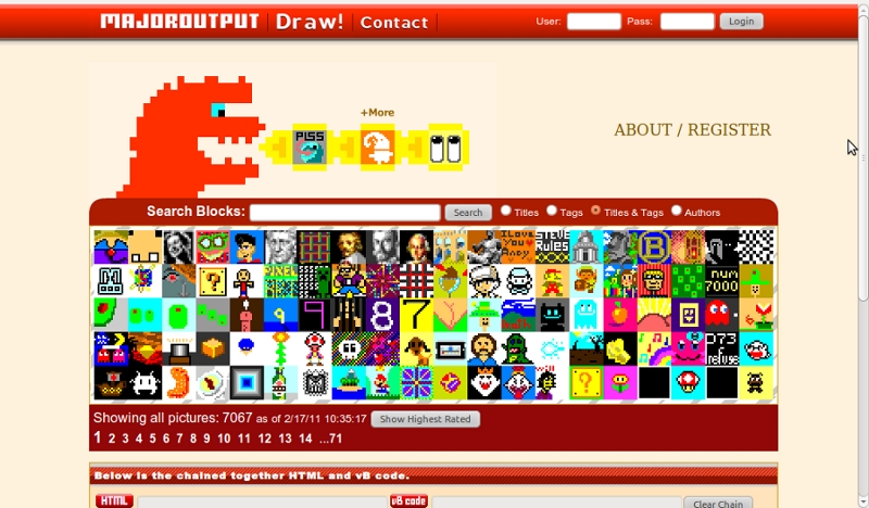
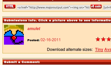
The image that I started before class was posted on their site.
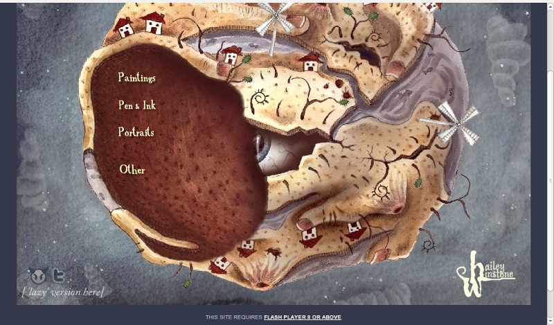
This artist's site was interesting. I liked the art style and I think it went well with the design. The only thing that I didn't like was how it broke the seamless quality when you actually clicked on an image. Opening it into a new window.
I liked the simplicity of this design. Very clean/high contrast. It would have been nice if the boxes that opened went down when you clicked them again. Something that made it so you didn't have to scroll too much.
Nice work on Project 1 everybody!
I have put all your mini-sites in the new projects section of the site. Take a look and view source.
From the syllabus:
(Option 1) Infographic
Using HTML, CSS, and images, create a single- or multi- page infographic on a topic that invites a systematic visual explanation. Prototype your idea with sketches, then move to code early. Use scale, white space, and a grid to describe and orient the user to the material. Don’t rely entirely on images to carry the information. We will emphasize iterating your design based on class critiques.
(Option 2) CV
Create an online version of your résumé that is detailed but easy to scan and read. Pay attention to which typographic “moves” translate well from your print version and which need to be reconsidered for the web. Consider incorporating web-specific technologies: microformats (hcards), embedded Google maps, or other dynamic elements that give the reader a bigger picture of your work experience, education, skills, etc. Include intra-page navigation or use multiple pages if necessary.
Whichever project you choose, be prepared to discuss your choice of layout techniques. We will view and critique the project on a variety of browsers, OSs, and mobile devices.
The point of Project 2 is for you (a) to practice using the web as a medium of information design, and (b) to wrestle with more advanced CSS layout techniques. Most likely you will want to incorporate a grid system, short bursts of explanatory text, and possibly icons, maps, photographs, or illustrations. As with Project 1, I think the best results will come from “doing a lot with a little” — that is, thinking through each design move so that they all count, rather than flooding the screen with a redundant or disorganized visual material.
If you go with the résumé/bio/about page, think about what makes your bio, work, skills, and interests unique. What are the common threads that you might be able to tease out and make prominent? If you’ve moved around the country or state, maybe you would want a map image to serve as the organizing principle of your site, and your experiences could be overlaid as boxes on top of the map. If you’ve worked while you’ve been in school, a timeline might be a good choice, since you could reveal relationships between the courses you were taking and the jobs you were working at any given point in time. Of course, it’s not critical that a single visual device orchestrate all of your information, but it’s good to have a hierarchy in mind, so that your audience can progress through your site in a logical way.
If you want to do the infographic, look for a subject, event, or data set that is meaningful to you or directly relates to your experience. I’ve found that a systematic and “objective” visualization of a topic about which the designer has a strong opinion often makes for the most compelling design work. If you feel you have promising source material (e.g all the books you read last year) but aren’t sure how to present it, try the LATCH acronym: how would the presentation differ if you organized your information by location, alphabetical order, time, category, or hierarchy? With the books example, each of those organizing principles could create radically different infographics.
With both projects, your primary concern should be finding a visual structure that tells your story best. When you brainstorm, sketch each of your ideas on paper and return to them frequently. What first seems like a silly idea may turn out to be great when combined with another one.